
The art of writing beautifully is still in vogue, which is why calligraphy writing enjoys great popularity in many areas. Those who do not want to write themselves can find fonts in a wide variety of styles on the internet. We present some that they may use commercially.
A calligraphy script wants to be not only legible, but first and foremost beautiful. Aesthetics clearly take precedence over pragmatism, regardless of the writing implement used, such as fountain pen, felt-tip pen or nib. But is this still at all in keeping with the times? Very much so, but let’s first look at the beginnings.
Table of contents:
- Origin of calligraphy writing
- Calligraphy as an art form
- Calligraphy font as a new trend
- Designing with calligraphy
- Download calligraphy font
Origin of calligraphy script
The ancient Greek term calligraphy comes from “kallos” (ancient Greek for “beauty”) and means “beautiful writing”. In fact, however, calligraphy does not begin with the Greeks, but even before. We know, for example, from the ancient Egyptians that they used both an everyday script and a “festive script”. The latter was reserved for particularly important scrolls.
During antiquity and the Middle Ages, the need for scribes increased steadily as books became more widespread. After all, all written documents had to be copied by hand. With the invention of printing, the importance of scribes’ offices declined rapidly. The profession of scribe became extinct.
Calligraphy as an art form
Legible writing was very important in business, but true calligraphy only experienced a renaissance towards the end of the 19th century – and as an art form. The works of the British artist and printer William Morris played a decisive role in this.
He inspired many other works, including those of Rudolf Koch. The German typographer developed various broken typefaces from 1910 to the 1930s, including, for example, Koch Fraktur and Koch-Kurrent (after his own Hanschrift). A downloadable font similar to this typeface can also be found in our collection Altdeutsche Schrift.
Calligraphy script as a new trend
.
The quill pen never quite went away. Pupils agonised with it in art education classes and isolated ambitious scribes put beautiful swashes on paper. For some years now, however, there has been a thriving calligraphy scene. There is a great demand for courses, pens, ink and templates – and the trend continues. Aphorisms in calligraphy on the wall are already a classic. Meanwhile, there are also home textiles and carpets with calligraphy elements.
Designing with calligraphy
In general, a calligraphy font looks good with all emotionally charged themes. First and foremost are all printed materials related to weddings. But this also includes personal invitations, Christmas greetings and thank you notes. A big plus for cards of all kinds is also: a nicely designed calligraphy on the cover page acts as a picture element and can thus replace a photo or illustration.
Calligraphy is also frequently used in marketing. Service providers such as hairdressers, but also bakeries, cafés as well as suppliers of handcrafted goods, for example, like to use sweeping fonts in their logos and business stationery.
Tip: We have checked all fonts for commercial usability, but cannot guarantee it; therefore, please check the respective font licence supplied or the notes on the respective download platform.
Download calligraphy font
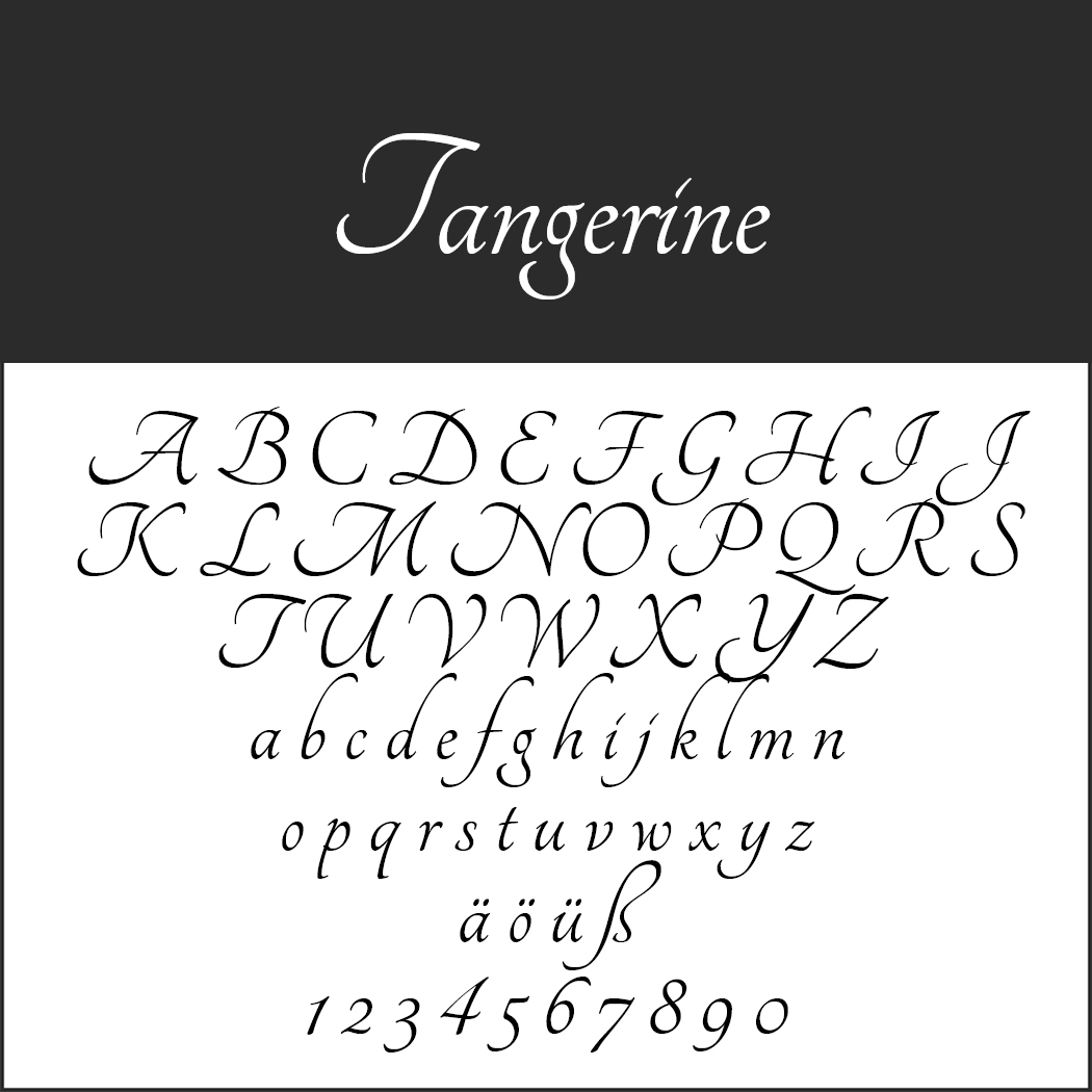
Tangerine
With Tangerine, the Japanese designer presents an elegant calligraphy font inspired by typefaces from the 16th and 17th centuries. The full effect unfolds with a large font size.
- Licence: SIL Open Font License (http://scripts.sil.org), readme file in zip folder
- Download directly as zip file
- Font format: TTF
- Design by: Toshi Omagari (http://tosche.net/)
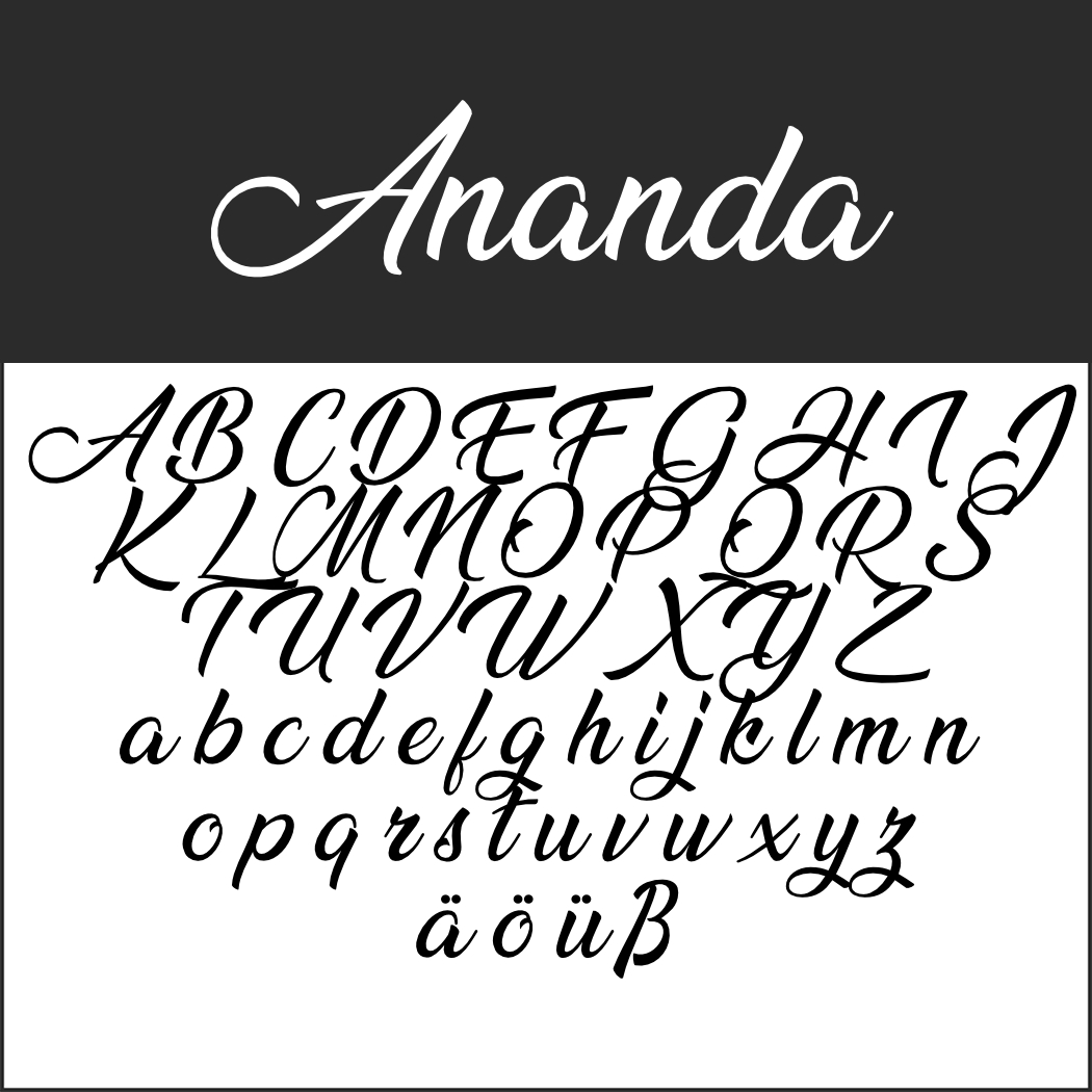 Ananda
The calligraphy font Ananda is particularly captivating because of its sweeping majuscules.
- Licence: 1001Fonts general font usage terms (https://www.1001fonts.com/licenses/general-font-usage-terms.html), readme file in zip folder
- free for private use only; commercial: https://billyargel.com/licenses/
- Download directly as a zip file
- Font format: TTF
- Design by: Billy Argel (https://billyargel.com/)
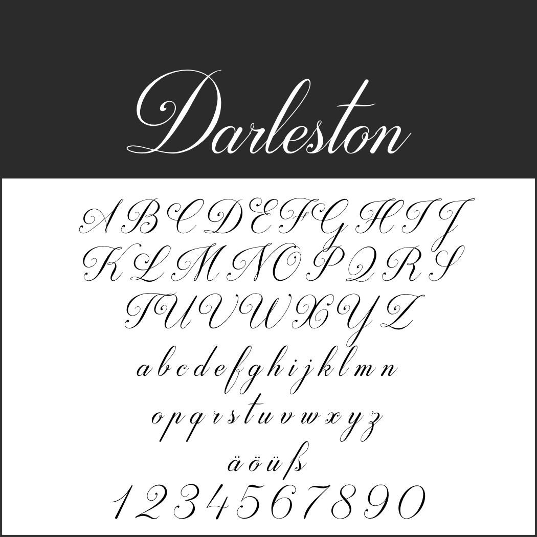 Darleston
Elegant and romantic in equal measure, Darleston is particularly recommended for wedding and Valentine’s Day themes.
- Licence: 1001Fonts general font usage terms (https://www.1001fonts.com/licenses/general-font-usage-terms.html), readme file in zip folder
- free for private use only; commercial: https://youssef-habchi.com/
- Download directly as a zip file
- Font format: OTF
- Design by: Youssef Habchi (https://youssef-habchi.com/)
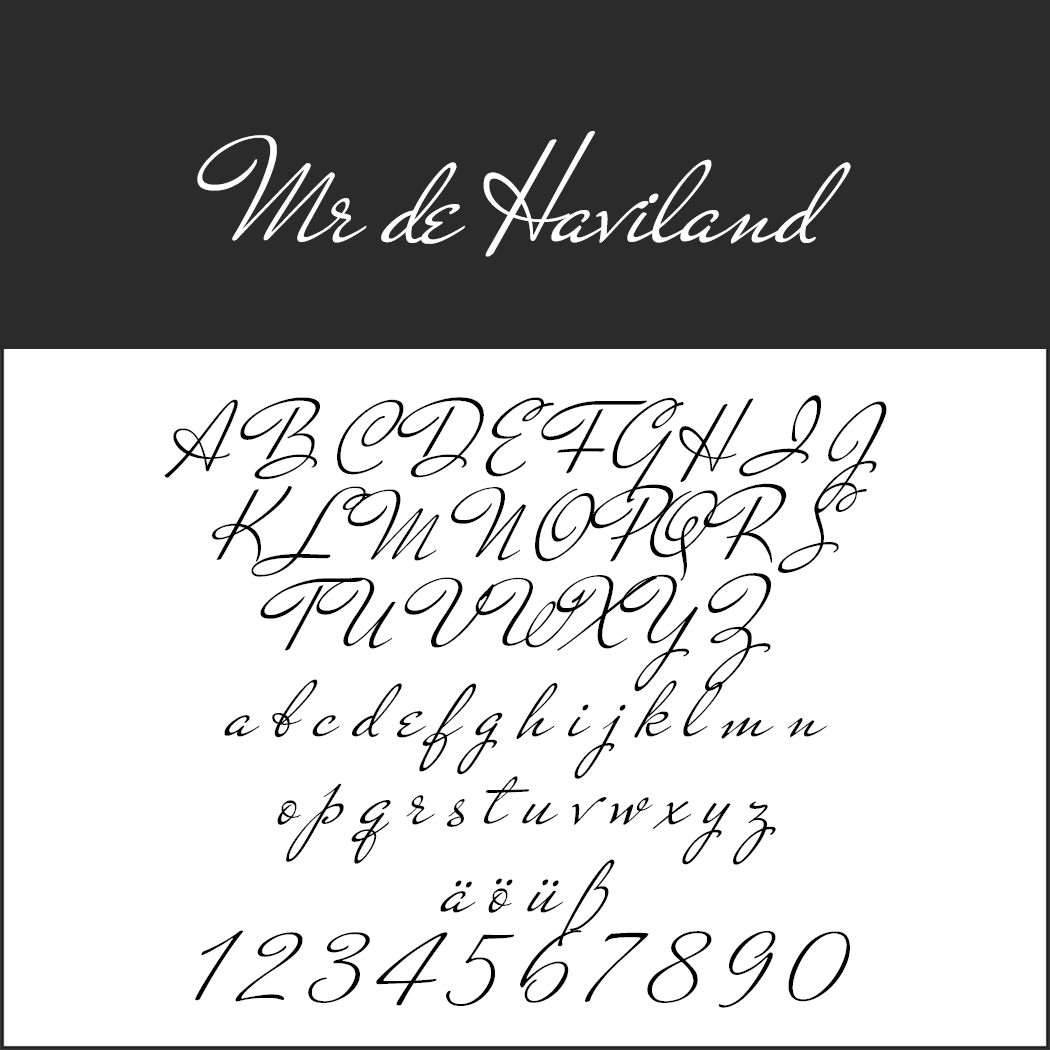
Mr de Haviland
Studio Sudtipos and designer Alejandro Paul bring typefaces from the collection of US-American Charles Bluemlein to life with their digitalisations. You can see one of these writings from the first half of the 20th century here.
- Licence: SIL Open Font License (http://scripts.sil.org), readme file in zip folder
- Download directly as zip file
- Font format: TTF
- Design: Sudtipos (https://www.sudtipos.com/)
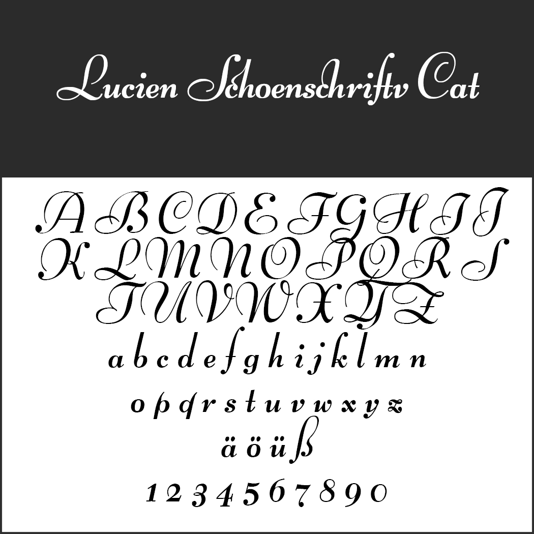
Lucien Schönschrift Cat.
This calligraphy typeface from the Bauersche Gießerei was designed by Lucian Bernhard in 1928. For the digital version, Peter Wiegel extended the ligatures.
- Licence: SIL Open Font License (http://scripts.sil.org), readme file in zip folder
- Download directly as zip file
- Font format: TTF
- Design: Peter Wiegel (www.peter-wiegel.de)
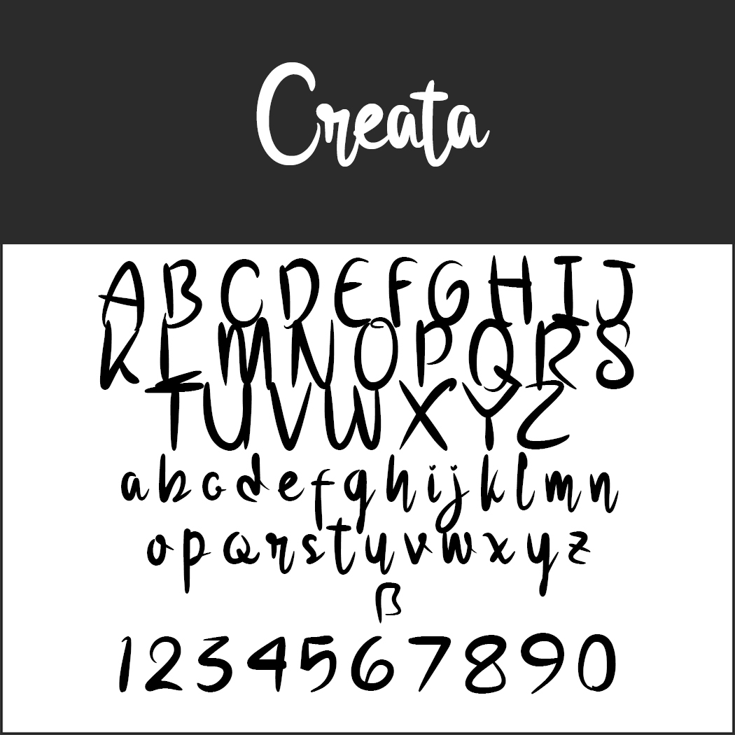
Creata
As the name suggests, the designer has given free rein to his creativity in this font. The result is a carefree font with modern elements that works especially well with large font sizes and for single keywords.
- Licence: 1001Fonts general font usage terms (https://www.1001fonts.com/licenses/general-font-usage-terms.html), readme file in zip folder
- free for private use only; commercial: https://www.glyphstyle.net/creata/
- Download directly as a zip file
- Font format: OTF
- Design: GlyphStyle (https://fontbundles.net/glyphstyle)
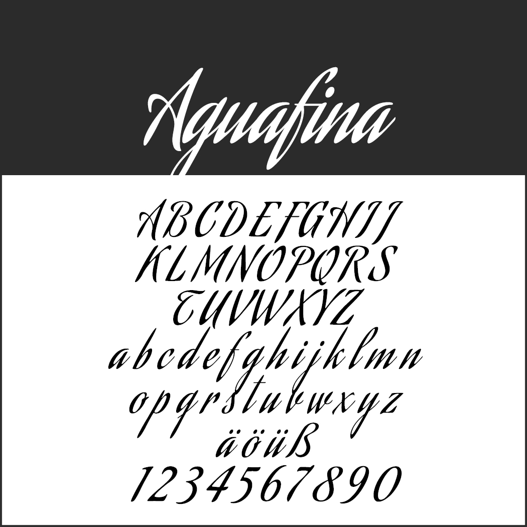
Aguafina
This exceedingly artistic font not only looks dazzling, but can be used in many ways. Its tall, narrow letters make it very space-saving in width.
- Licence: SIL Open Font License (http://scripts.sil.org), readme file in zip folder
- Download directly as zip file
- Font format: TTF
- Design: Sudtipos (https://www.sudtipos.com/)
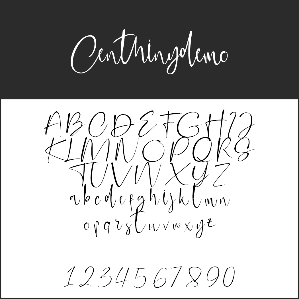
Centhinydemo.
Romantic – is the first impression. The font is then particularly suitable for weddings and other matters of the heart, but is only of limited use as an information carrier because of its difficult legibility.
- Licence: 1001Fonts general font usage terms (https://www.1001fonts.com/licenses/general-font-usage-terms.html), readme file in zip folder
- free for private use only; commercial: www.glyphstyle.net/centhiny/
- Download directly as a zip file
- Font format: OTF/TTF
- Design: GlyphStyle (https://fontbundles.net/glyphstyle)
 Knuckle Head
With squiggles and some intentional inaccuracies, this font from Indonesia looks like it was written by hand.
- Licence: 1001Fonts Free For Commercial Use License (https://www.1001fonts.com/licenses/ffc.html), readme file in zip folder
- Download directly as a zip file
- Font format: TTF
- Design: SSI.Scraps (https://www.behance.net/syukurseti5a19)
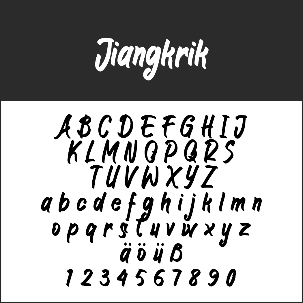 Jiangkrik
The poster font par excellence: anything that needs to stand out big is in good hands with this font.
- Licence: 1001Fonts general font usage terms (https://www.1001fonts.com/licenses/general-font-usage-terms.html), readme file in zip folder
- Download directly as a zip file
- Font format: OTF
- Design: Anton Cahyono/Motokiwo Design (https://creativemarket.com/Motokiwo)
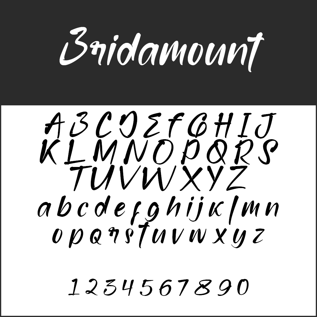 Bridamount
The playful font is reminiscent of film posters from the golden age of the big cinemas and is therefore perfect for a sophisticated appearance.
- Licence: 1001Fonts general font usage terms (https://www.1001fonts.com/licenses/general-font-usage-terms.html), readme file in zip folder
- free for private use only; commercial: https://www.glyphstyle.net/bridamount/
- Download directly as a zip file
- Font format: OTF, TTF
- Design: GlyphStyle (https://fontbundles.net/glyphstyle)
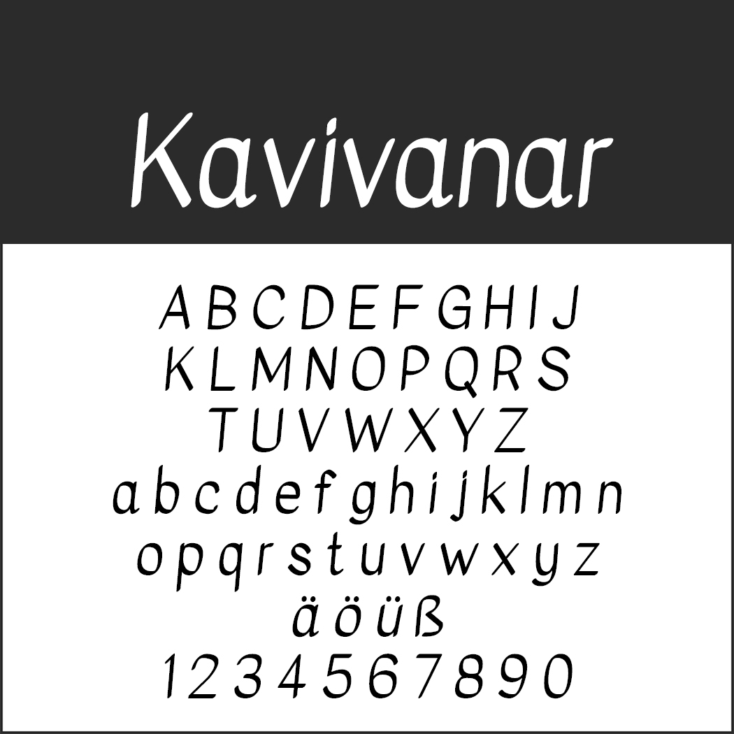 Kavivanar
The unconnected letters, which look carefully written with a pen, are particularly suitable for longer text passages in small font sizes.
- Licence: SIL Open Font License (http://scripts.sil.org), readme file in zip folder
- Download directly as zip file
- Font format: TTF
- Design: Tharique Azeez (https://thariqueazeez.com)
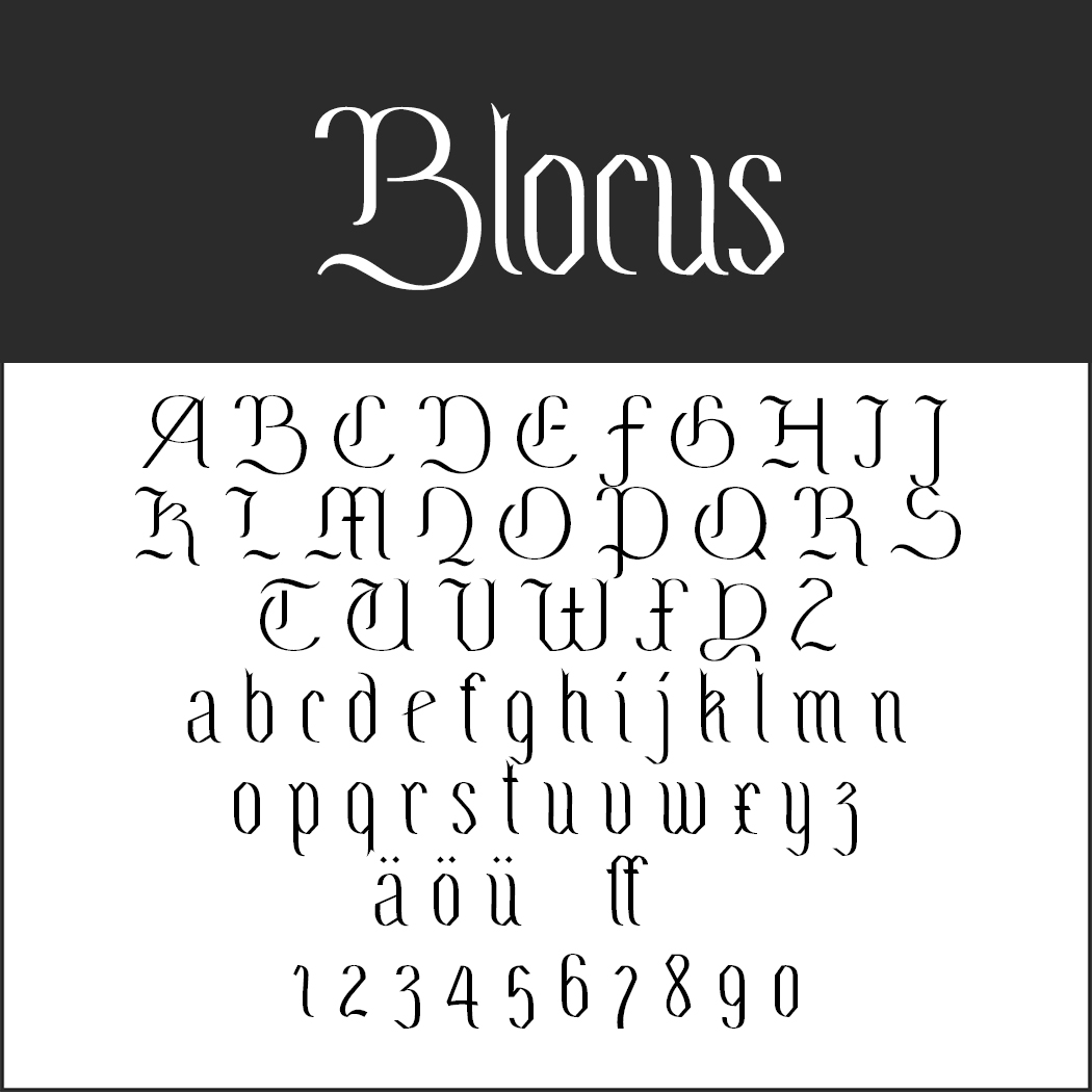 Blocus
The French designer places his font “somewhere between Fraktur and Didone, with broken curves, a strong contrast between thick and thin lines and an imposing vertical”. In any case, Blocus is exceptional and attention-grabbing.
- Licence: SIL Open Font License (http://scripts.sil.org), readme file in zip folder
- Download directly as zip file
- Font format: OTF/TTF
- Design: Velvetyne Type Foundry (http://velvetyne.fr/)
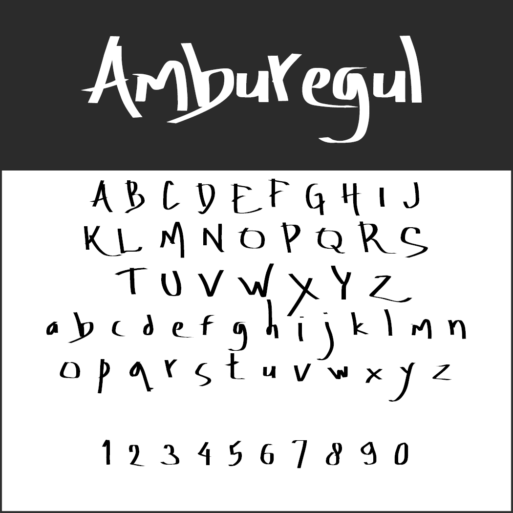 Amburegul
The idiosyncratic font with seemingly haphazardly stroked elements develops its great strength in words of six to twelve letters.
- Licence: SIL Open Font License (http://scripts.sil.org)
- Font format: OTF
- Design: Aydi Rainkarnichi
Why not add a highly customised touch to your next existing customer mail campaign by using a calligraphy font and having your promotional message printed with it on a postcard?
This article was first published on 21 April 2020 and updated 5 April 2023.
Image source: Elizaveta Galitckaia via Shutterstock
