
What does an infographic need to visualise data in a clear and engaging way? Which online tools are suitable for which needs? We have tested different tools and provide tips on how to create awesome infographics.
Contents
- What you should know about creating infographics
- A check of six online tools
- Summary of the online tool check (with a tabular overview)
- Infographics from stock photo agencies
- If you don’t have time… using design marketplaces
What you should know about creating infographics:
Infographics have become a staple in the classroom, at the workplace and everywhere we want to communicate ideas in an easy-to-digest format. When done well, infographics make complex information more accessible. They reduce information overload by delivering abstract, complex and dense content efficiently, precisely and clearly without overwhelming readers with endless lists or walls of boring text. Infographics are all about condensing a lot of information to present only the key points in a visually appealing format that most readers can understand. This makes it easier for readers to grasp and take away the core message.
It is the ideal medium for web use.
The physical world around us is filled to the brim with information. This is also true for the innumerable digital worlds on our smartphones, computers and other media. Digital data highways never stand still and we often feel overwhelmed by the sheer mass of images and information when browsing the web. Since we are continuously consuming digital content (which occasionally overwhelms us), we prefer information that is presented in an engaging and easy-to-grasp manner. This is one reason for the rise in popularity of infographics over the past years – also for marketing purposes.
The perfect tool for online marketing
Infographics are ideal for online marketing: They allow relevant information to be presented in a clear and visually stimulating manner, reaching a wide audience and generating more traffic, for example. When an infographic goes viral and spreads across different channels, it can help open up new target audiences or readers and boost brand awareness. Linking to infographics on the internet can moreover effectively contribute to search engine optimisation.
Which data is suitable to create good infographics?
Infographics allow complex information to be visualised clearly – from technical processes, operating instructions, statistics and analyses to presentations of companies, teams or product lines. A good approach to designing an infographic is also to pitch events in a chronological sequence. This way, the corporate history and complex processes can be structured in an illustrative manner as well as portraits, comparisons or summaries.
How to design an engaging infographic?
An infographic should have a subject. So the first thing you should do is think about which facts and figures you want to present and then start to design your infographic. Also you have to decide about which type of infographic you wish to use. Do you want to map a chronological order, make a comparison or create a list? This will be decisive for the ultimate shape of your infographic. An infographics is a visual presentation of relevant information so the design elements should fit the presented content and not the other way round.
Tip: The elements of your infographic and the font size should be sufficiently large – it is better to continue the infographic vertically than try to pack too much content over the limited width or use a font size so small it can hardly be read. This assures that the infographic can also be viewed comfortably on a tablet computer or smartphone.

A good infographic
– presents relevant information,
– uses supporting visual tools (images, icons, charts etc.),
– is clearly structured,
– has a consistent theme,
– maintains a good balance between images/text and white space,
– does not contain too much text or images
– and is visually appealing.
A check of six online tools
However, you should be aware that it takes time to create a good infographic (and can be nerve-racking, too, especially if you are new to the task). Online tools make the process of creating an infographic easier and more quickly for users by offering a variety of useful design elements that facilitate the process. None of the following online tools will help you magically design a customised and creative infographic out of nowhere. At first, the multitude of functions can seem overwhelming and you have to get used to the interface and the myriad of options (some tools offer thousands of elements which can be added to the infographic), even if you are familiar with other design programs.
We tried out the free service of six online tools and tell you what we liked and disliked about them. Canva, Piktochart, Infogram, Easel.ly, Visme and Venngage.
Canva
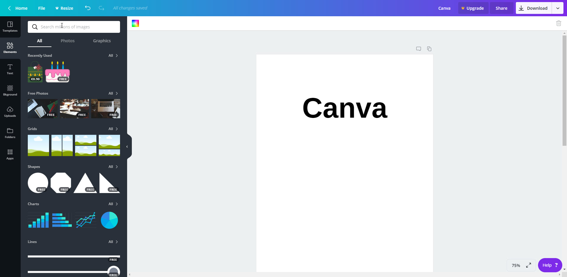
The Canva graphic design tool also features an infographics maker. First you have to register before you can try out the editor. Registered users get about 20 free templates – recognisable by the little “free” icon in the lower right corner. If you don’t want to make major changes to the layout, adding your own text to the infographic is done in a breeze.
You can change the templates (completely) to your heart’s desire. Canva provides a vast library of images, icons, fonts and features for this purpose – more than two million according to Canva and a lot of them are free. Thanks to the ability to upload and include your own images and designs, Canva allows you to tap into the depth of your creativity.
Tip: The website provides a search function in which you can enter words or phrases to search for. You can also combine search terms (see Advanced Search in the Help Center).
A major advantage of Canva is the option to download your design in different file formats or to share or embed them on various platforms. Moreover, you can add bleed to your infographics with a mouse click to turn them into print-ready PDF files for download. The option to embed other online media such as videos or social media channels and posts is another awesome feature – Go to Apps Embed and add them to the left pane. Next paste the link to the medium, done.
You can also purchase elements for the affordable amount of around 90 cents. This means that after buying a premium element, you are entitled to use it once in your design for a period of 24 hours. It is a good idea to first add the elements with the Canva watermark to your design and then purchase the premium elements before exporting the finished infographic. Pay attention to the licensing agreements, especially if you need multiple usage as well as print and resell rights.
- Pros
- Intuitive operation
- 1 GB storage
- Free design elements and paid premium elements are clearly distinguishable.
- Sharing on social media and embedding
- Download different formats (e.g. print-ready with bleed)
- User-friendly help center (lower right)
- Large graphics selection (and many fonts and text fields)
- Link numerous online media (videos, social media posts, crowdfunding projects)
- Cons
- Large graphics selection may be too much for beginners.
- Fixed template size of 800 x 2000 px (can only be changed in the Pro version)
- Free elements cannot be displayed alone (except photos).
Conclusion
The sheer mass of design possibilities (changing colours and a plethora of free elements) is a big plus. However, novice users that lack design expertise may feel that this is too much. We therefore recommend that beginners first play around with the tool and its functions before tackling their infographic project.
Ideal for
- creative heads, makers and experienced designers
- professionals and graphic artists
- companies and freelancers
- curious first-time users who love a challenge
- people not fluent in English
Piktochart
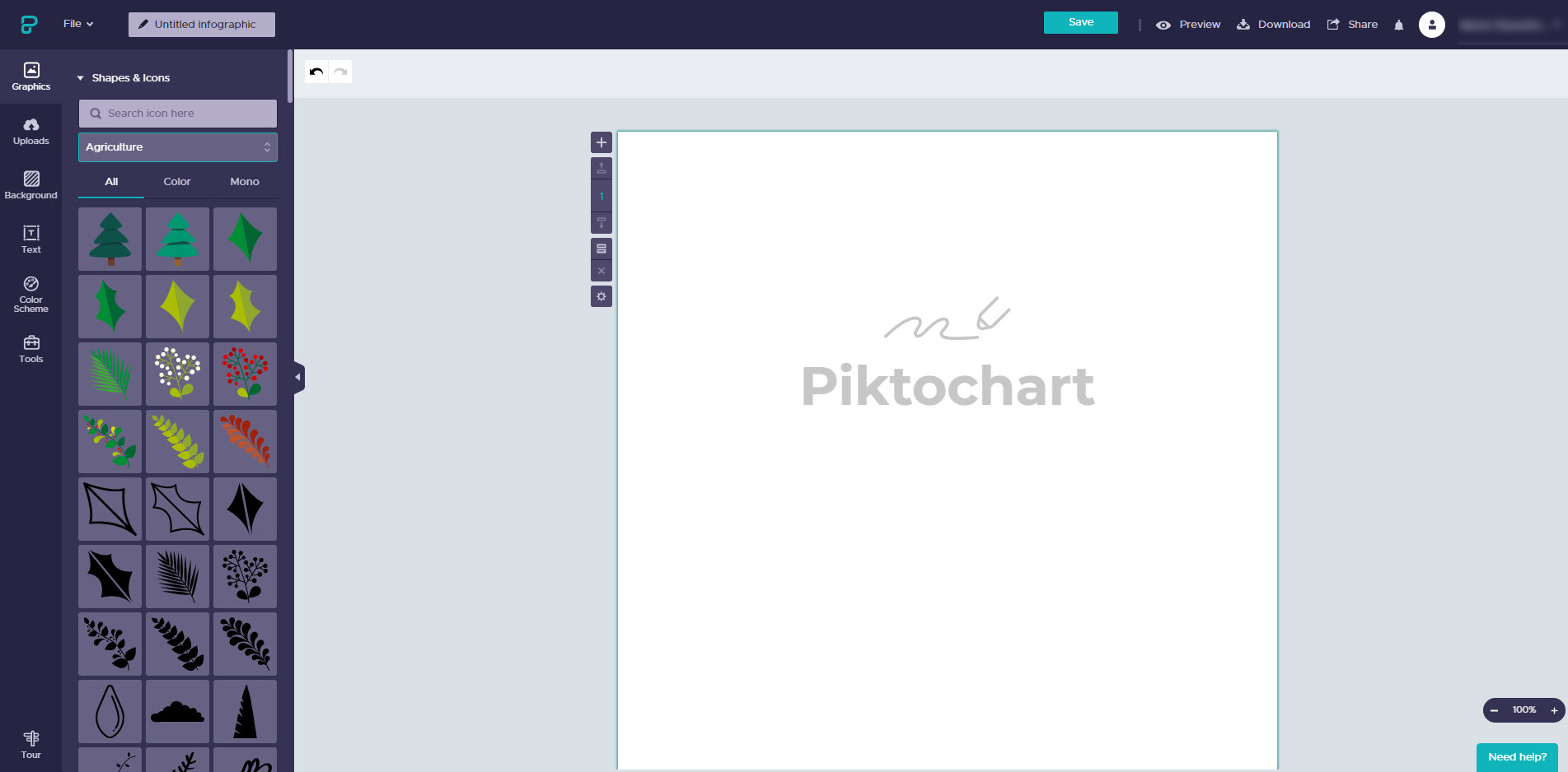
Although the Piktochart tool is available in English only, it’s intuitive to operate thanks to the use of pictures and limited text. To get an overview of the free templates (twelve), click the Infographic tab. It contains different kinds of templates such as portraits, employee, product or project presentations – however, the selection could be a bit more varied.
A big plus: Already the free version allows users to define the size of their infographic by clicking the cogwheel icon on the left of the graphic. The tool also allows users to align graphical elements and resize images proportionally.
Piktochart comes with a comprehensive library of shapes and icons. All graphic elements are also available in the free version. You can browse the elements by colour or subject to quickly find what you are looking for. The Text tab moreover contains text frames; these are icons and symbols combined with text.
The sparse photo library with images from Piktochart users has recently been expanded by the Unsplash photo database. The latter offers a potpourri of themes and permits the private and commercial use of its photos. However, users cannot search both databases simultaneously but have to switch between them.
Tip: Use the search function to browse the tool for useful information.
The photo frames are an ingenious design feature to create more engaging infographics. Just select a frame and drag a photo onto it. Embedding a map of the world or region as well as charts are other useful features to present data in a visually appealing manner.
- Pros
- Intuitive operation
- Define custom template size
- Photo database expanded by Unsplash
- Download (only) as PNG
- 12 free templates (harmonic colour scheme can be selected for some)
- Cool text and photo frames
- Embed online videos
- Presentations (on your own computer) also possible if unpublished
- Cons
- Sharing only possible via publishing on Piktochart
- Piktochart branding
- You have to switch between photo databases.
- Storage: 40 MB
Conclusion
Piktochart enables you to turn boring data into creative and engaging custom infographics that are branded. Sharing on social media and other platforms is only possible after the infographic has been published on the provider’s website. The result can be downloaded as a PNG file in medium resolution already in the free version. However, if you want to add a lot of pictures to your infographic, you have to make do with 40 MB storage capacity.
Ideal
- for creative heads, makers and experienced designers
- for first-time users
- to try out and play around
- for users who don’t want to upload more than 40 MB of image material
Infogram
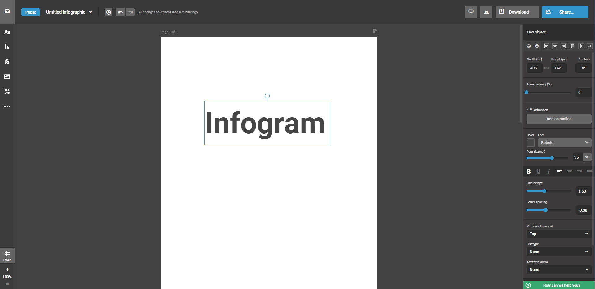
You can choose different languages in your account with Infogram and switch the user interface to a different language.
Users benefit from eight free and versatile templates. Upon selecting a template, the tool informs the user that it will be immediately public and accessible(!) in the free basic account – and not after it is finished. So in theory each work step could be followed live by an external observer. This is a big handicap which makes the free version of the tool inappropriate for professional applications. And when using the tool to make infographics in your free time, you should carefully consider which private information and photos you want to share while the infographic is in process. Unfortunately, downloading the infographic is only possible after purchasing the upgrade.
The left bar contains various elements such as graphics, shapes, text fields, etc. for selection. Unlike most other online tools we reviewed, a new operating panel opens on the right after selecting an element where users can customise text or icons in a clearly structured manner to create a more creative and personalised result. It also accommodates animations which are a real gem of Infogram. You can turn a line, text or chart into a moving element with just a few clicks. It also gives access to the gifs of Giphy.
The selection of functional and engaging charts is inspiring; however the library of free images is rather limited. Thanks to cooperations with the image platforms Pixabay and Unsplash as well as icon provider The Noun Project, the database comprises a million photos and icons but many of them are only accessible after purchasing an upgrade. You can work around this limitation by browsing Pixabay or Unsplash for free photos that can be used for private and commercial purposes, download them and upload them back to Infogram. However, the upload is limited to ten images.
- Pros
- Intuitive operation
- Pro elements are marked “Upgrade” or with a star.
- Layout help (lower left)
- Infogram is available in multiple languages
- Large icon library (cooperation with The Noun Project)
- A nice selection of animations, gifs and charts
- Embed various media (video, social media posts, URLs)
- Integration (Google Analytics, Dropbox, etc.) possible
- Cons
- No private use! >>> Template is published immediately after selection (each editing step visible)
- Download only possible after upgrade
- Infogram branding
- Storage capacity for 10 images
- Upgrade needed to access the free image databases of the agencies (Unsplash, Pixabay)
Conclusion
Infogram offers many gimmicks and design options to create unique and eye-catching infographics. But there is a noticeable gap between the free Basic version and the paid Pro version. And while the numerous animations, gifs, charts, icons, embed and integration functions make Infogram a versatile tool, the attractiveness of the Basic account suffers greatly by the limited functions (no download, no private use, etc.).
Ideal
- for creative heads, makers and experienced designers
- to visually present public data
- to try out the tool before purchasing the Pro version
Easel.ly
After registering with the online tool Easel.ly, users get very limited access to templates and elements. If you start from scratch, you have to content yourself with one of ten backgrounds. The tool offers a moderate selection of images, charts, shapes and text fields. Only icons are abundant (under Pictogram) if you use the search function.
The large overview of community examples is a real asset when creating infographics with Easel.ly. Just pick one as a template and customise it to your needs. This is a good idea especially for users who do not want to go too deep into the layout and change text mostly. The community examples are frequently comic style infographics and include graphic symbols and no photos.
In some aspects, operation of the online tool is not consistent: To insert an element into the infographic, you don’t have to click it but drag it onto the workspace. To draw a line, click the desired line tool. Then click on the line you have drawn to open its menu and edit it (change colour or weight, for example). To change text, a static text field opens showing only the words but no changes of the font or colour. They only become visible in the draft after closing the editing window.
To design infographics for private purposes only, you have to subscribe to a Pro account (costs four US dollars per month). Otherwise, the graphics are shared automatically with the Easel.ly community. The result can be downloaded as a JPG file in low resolution.
- Pros
- Many icons
- Community examples both as an inspiration and as usable templates
- Video tutorials
- Download as JPG, however, in low resolution
- Cons
- Inconsistent operation
- Access to few images
- Support area and chat cannot be opened from within the editor but from the start page.
- Other languages are available, but the translation is incomplete and sometimes not good.
Conclusion
The tool features an impressive wealth of (mainly comic-style and colourful) community infographics that can be used for your own creations. But Easel.ly is not as easy to operate as its name suggests – at least not for beginners or inexperienced users. The availability of other languages is not very helpful as the translation is incomplete.
Ideal
- for comic style infographics
- for creative heads, makers and experienced designers
- users who don’t mind investing time and effort into getting familiar with the tool
Visme
The varied template selection provided by Visme is ideal to present business data because of their professional look. A short list of twelve free templates is followed by paid options highlighted as “Premium”. Then there are templates sorted by theme (such as process graphics and timelines) including more free options. So it’s worth taking a look. The selection of theme colours is a great feature. It allows the colours of the infographic to be adjusted with one mouse click.
In addition to more than 500,000 free photos from the Unsplash image database, there are numerous icons, shapes and other awesome features such as charts, genealogical trees or animations. Premium elements are highlighted accordingly. Click the cogwheel icon and then Save to library to save photos in your own library for future use. The photo collection is limited to 100 MB storage which is also used for the user’s own uploads.
We liked the selection of elements but it took us a while to get used to operating the editor. This is because the infographic is organised in blocks of customisable length. Photos dragged onto the graphic are automatically assigned to one block. Make sure not to drag a photo in the upper section (background) or else it will end up as background.
It’s a shame really that only five projects can be edited and that sharing is only possible after publishing the infographic on Visme. The file download in contrast is favourable, however, only as a JPG – but in the original size.
- Pros
- Access to 500,000 Unsplash photos
- Free design elements and paid premium elements are clearly distinguishable.
- More than 30 free templates
- Change size
- Download as JPG
- A library to collect/save photos
- Varied elements and features (charts, genealogical trees, animations)
- Cons
- Limited to 5 projects
- Sharing only after published on Visme
- Visme branding
- Storage: 100 MB
- Help pages not in the editor
Conclusion
Visme helps you to turn boring data into engaging infographics. This also applies to infographics for business use – but you have to remember that they cannot be shared privately but are published on the platform with the provider’s branding.
Ideal for
- creative heads, makers and experienced designers
- professionals and graphic artists
- companies and freelancers
- beginners
Venngage
Venngage offers more than 200 free and professionally looking templates. The template pool comprises different categories such as chronicles, process graphics or lists from which you can choose up to five for your projects. The paid features are marked as “Premium” and “Business”.
Once the user has picked an infographic, they can customise it using many icons, shapes, lines and symbols . Free and paid elements can be distinguished easily. The icon library is sorted by themes to facilitate browsing. After inserting an icon in the infographic, you can also add it to your favourites, which can be helpful for future infographics. The tool provides a comprehensive image library, but you can upload only six photos.
Tip: Venngage is available in multiple languages. But it is better to search for English terms as this will return more accurate results.
Venngage offers a getting started guide which gives an overview of the editor functions as well as advanced video tutorials and a help center to make it easier to use also by non-designers. To share or download your infographic, you have to upgrade to the paid Premium account. In the free version, you can only publish your infographic with the Venngage watermark.
- Pro
- More than 200 free templates
- Free design elements and paid premium elements are clearly distinguishable.
- Many free elements (icons, charts, images)
- Save favourite icons
- Getting started guide
- Kontra
- Premium version required to share and download
- Venngage branding
- Upload limited to 6 images
- Limited to 5 projects
Conclusion
The sheer mass of free templates is both inspiring and overwhelming – especially non-designers will surely find a template they can use without making a lot of changes. Once you have got used to the tool, designing infographics is fun and easy to do. However, it’s a shame that you cannot download but only publish infographics. This makes the free version unsuitable for users who want to present sensitive or private information.
Ideal
- for infographics containing public data
- for beginners, creative heads and makers
- to fill a template with data (and make only few layout changes)
- for professional users who do not want to upload a lot of images
Summary of the online tool check

The six online tools allow infographics to be created more or less easily and quickly; all of them are (mostly) intuitive to operate. Each tool has its pros and cons that make it perfect for one user but not so much for another user (maybe only for a specific task).
We recommend:
Figure out what you actually need from a tool and then decide. Our presentation of pros and cons of each provider can be helpful to make a decision.
A brief fact check of the free versions
| Canva | Piktochart | Infogram | Easel.ly | Visme | Venngage | |
| Storage space for own images | 1 GB | 40 MB | 10 images | No limits | 100 MB | 6 images |
| Download as | PNG, JPG and PDF, without branding | PNG | – | JPG, without branding | JPG, without branding | – |
| Free templates | 20 | 12 | 8 | 10 (plus community examples) | more than 30 | more than 200 |
| Our assessment |
We also recommend certain tools for specific requirements:
- Canva, Easel.ly and Venngage are great to quickly create free infographics without branding which you can download.
- If you wish to include a lot of your own material in your infographic but don’t have a graphic editor, we recommend Canva (because of the large storage capacity).
- If you prefer pasting your own texts into a ready-made template, we recommend Canva, Visme, Piktochart, Venngage or using a template from a stock agency – but make sure it is a vector graphic.
- If you want to use the online tool for business, we recommend
- Canva (because of the varied download options and versatile elements and functions)
- and Visme (because of the variety of elements and functions).
- If you prefer an online program in another language, Canva is the tool to get.
- If you have little or no experience in working with graphic editors, we recommend
- Piktochart (because of its intuitive operation and well-structured selection options)
- as well as Venngage and Visme (because of the good free infographic templates).
- If you intend to use charts, we recommend Canva, Piktochart, Venngage, Infogram and Visme.
- To include animated elements, Infogram and Visme work nicely.
A brief overview of the premium packages
If you are interested in purchasing a full version of the above tools, you should first try out the free version. Links to the different packages:
| Premium packages | from $ … per month | (circa EUR …) |
| Canvas for work | 9,95 | 9 |
| Piktochart Lite | 12,50 | 11 |
| Infogram Pro | 19 | 17 |
| Easel.ly Pro | 4 | 3,50 |
| Visme Standard | 19 | 17 |
| Venngage Premium | 16 | 14 |
Infographics from stock photo agencies
If you don’t want to use an online tool but prefer a graphic program to create your infographic, you can get inspiration from both the above tools and stock photo agencies. The latter also provide ready-made templates which can be populated with custom content to create personalised infographics.
However, the free image databases are not recommended for this purpose. Shutterstock and Adobe Stock provide innumerable professional templates and individual elements that are ideal to this end. When working with such templates, make sure that they are in a suitable vector-based file format. This enables you to both add your own content and customise the graphic to create your own unique visualisation tool.
Ideal
- for professional users and graphic artists
- for experienced designers
If you don’t have time… using design marketplaces
If you don’t have the time to make an infographic yourself, you can hire a professional visual communication agency. Or you could contract a freelance designer to do the work for you. The internet offers various platforms and marketplaces to find and hire a professional contractor.

On 99designs you can hire a designer or launch a contest to invite members of the designer community to submit their proposals Prices start from EUR 349.
Freelancer enables you to post a project and invite designers to submit their bids. But you can also search for a specific artist to request a quote.
designonclick.com/ is another option. On the website, you can either post a project and set a fixed price or submit a request to quote to a specific designer. Prices for infographic designs start from EUR 214.
Photo credits:
Lead story – Andrew Derr (via Shutterstock)
geralt (via Pixabay)
Pinar Ince (via Shutterstock)
athree23 (via Pixabay)
Andrew Derr (via Shutterstock)
Zdenek Rosenthaler (via Shutterstock)
YEYEQINQIN (via Pixabay)


