
Stand out to win! In a nutshell, this is what packaging design is all about. But this is easier said than done in a large grocery store boasting thousands of competing products. And it isn’t necessarily the packaging with the boldest colour combination that is most eye-catching. You have to get inventive and follow certain tips to be successful.
Have you ever stood in front of a full supermarket shelf and made your purchase decision based on the appearance of the packaging? In this case, the designer has succeeded in making his or her design stand out from all the other products on display. But there is much more to nailing a perfect packaging design than a pretty box or stylish bottle. Years of expertise and an acute sense of trends are crucial in this respect.
Content:
The dos & don’ts – the art of packaging design
The designer of a packaging faces certain challenges that do not seem easy to overcome at first glance. The appearance of the packaging should appeal to the current taste of the target audience without being arbitrary. The design must be eye-catching, reflect the brand communication strategy and feature the corporate colours. The challenge is to master the balancing act of creating a simple yet attention-grabbing design. So what can you do as a designer to stand out from the crowd? The answer to this question may sound simple: Do something no other product on the shelf is capable of. However, this usually requires a great deal of expertise.
So what do the designer and ultimately the finished packaging design have to accomplish?
- DOs
- Appeal to the right target audience. Targeted copy combined with a matching design is key in this context.
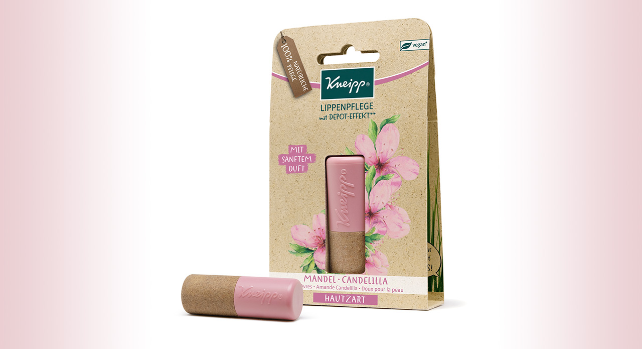
- Include the corporate design and the brand core. Think of the natural shower gel in a plastic bottle – without a sophisticated brand concept, the packaging can ultimately be decisive for the purchasing decision.
- Tell stories and evoke emotions. The packaging is the first thing the customer sees. So it should tell a clear story about the product and/or brand.
- Display legally required information. Especially food packaging is subject to specific labelling
- Protect the content adequately. This applies to both the shape/stability of the packaging itself and to the design. Using food safe printing inks or giving instructions on how to open the package will protect the content.
- DON´Ts
- Want too much. Overloaded designs tend to annoy customers who have to read forever to learn about ingredients, application steps and more.
- Mislead customers. Our experiences allow us to associate a specific packaging with specific contents. If you sell canned socks to attract attention, it should be clear at first glance that there are socks inside the can and not something to drink.
- Follow every trend. Remember that trends don’t last and may not work for you or your product.
- Produce too much unnecessary packaging waste. Sustainability also appeals to target groups that don’t shop exclusively in organic supermarkets.
How does the product stand out from the crowd? Below we present a few real-life ideas and examples.
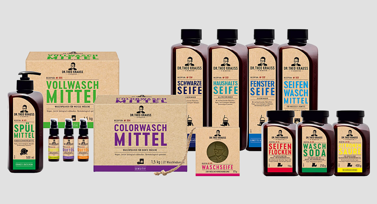
- Stand out by daring to choose bolder colours for your packaging than your competitors. This does not necessarily mean that you have to use bright red everywhere to get noticed. Pique the curiosity of potential customers by putting a twist on your colour scheme.
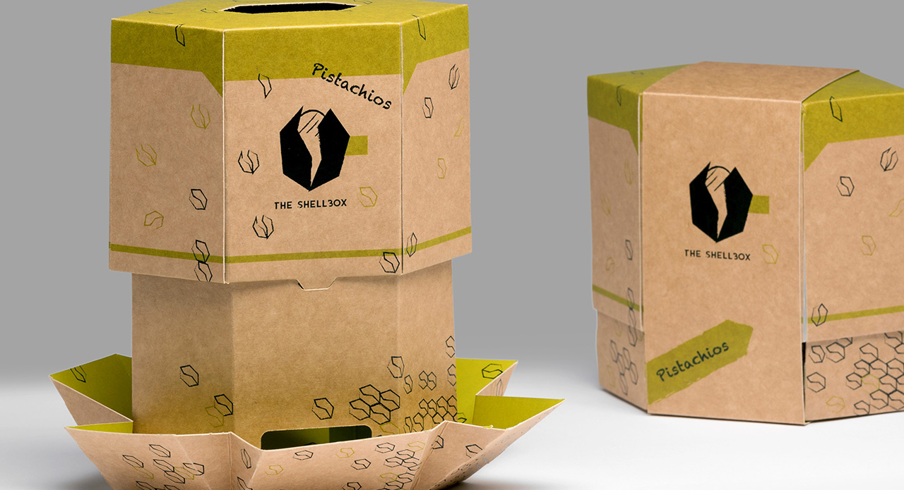
- Divert product packagings from their intended use. Choosing a can for socks, for example, is not only unusual but also eye-catching.
- Try specially shaped product packages.
- Be consistent with the brand concept to convince your target audience.
The last point may sound dull and uninspiring, so let us illustrate this aspect by looking at two examples: Recyclable tea bags do not create a convincing impression when sold in plastic packaging. On the contrary, this could deter informed customers. A positive example is a natural shower gel in a 100 % recyclable plastic bottle. Here, the packaging could be the decisive purchasing argument. Such integrated brand concepts are well received by discerning customers.
Not following every trend is all well and good, but which trend should I follow?
The problem with this aspect is that it always requires a certain amount of forecasting that can never be certain. However, there are a few “consistent trends” such as:
- sustainable materials and reduced packaging waste,
- simple designs and clear statements,
- meaningful colours and
- being faithful to the corporate design.
A step-by-step guide to nailing the perfect packaging design
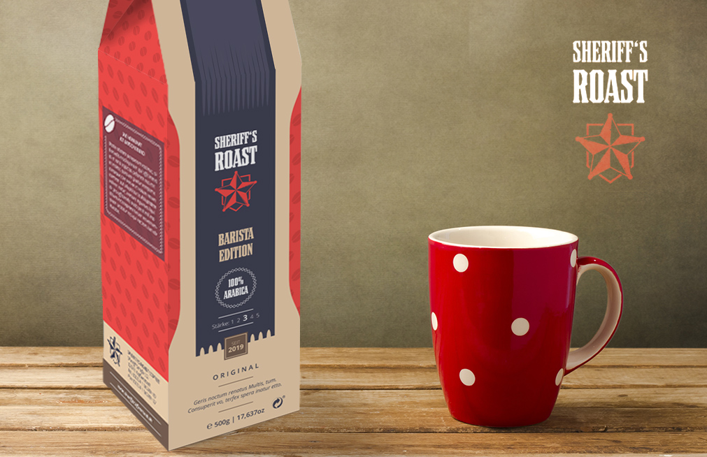
Sample project: Sheriff’s Roast coffee roaster has commissioned a new packaging design.
Text tutorial and design tips
The fictitious coffee roasting company “Sheriff’s Roast” has launched a new product and wants to promote its marketing with an eye-catching packaging design. Before the designer can get cracking though, a few things need to be done. During a meeting with the customer, the designer asked about the customer’s ideas and expectations for the packaging design and presented design proposals. Moreover, the customer provided the designer with its company logo, fonts to be used, relevant colours and copy. It is also known that the coffee will first be wrapped up in a vacuum sealed bag which will then be packed in the newly design cardboard box.
Based on this information, the designer can start to look for a suitable packaging solution. The Onlineprinters web shop provides various products that work well for this purpose. The designer chooses the bottle bag as outer packaging for the new coffee roast. It can easily be repurposed as coffee packaging and is sure to stand out on the shelf among the other coffees which are usually packed in vacuum foil bags of different sizes.
A packaging that is unusual for the product stands out among the competing products on the shelf. This is a good way to attract the attention of the target audience.
Downloading and understanding print templates
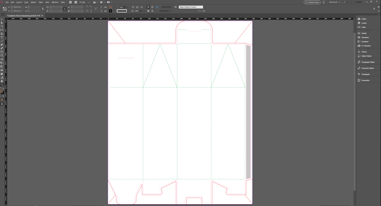
Many online printers provide print templates for download which are tailored to your products. These template may seem somewhat confusing at first. But all visible lines serve a purpose. Let’s take a look at the bottle box from Onlineprinters. The red lines indicate the die-cutting contour. The fold-in flaps, which will be used to close the packaging later on, are clearly visible. The dotted green lines indicate the creases along which the packaging will be folded later on.
To understand a packaging print template, imagine a paper boat that is unfolded again. The visible crease lines are comparable to the dotted lines in the print template.
The first sketch
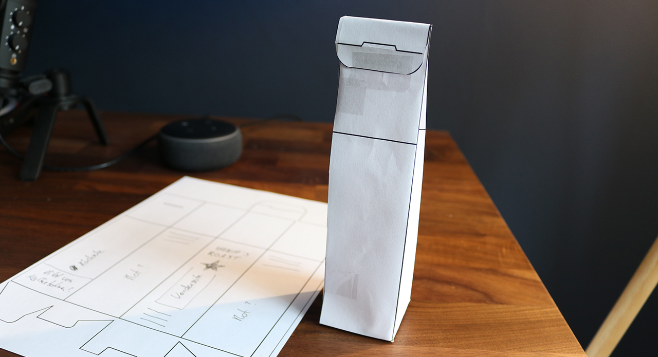
Designers like to have something physical they can look at from all sides. You can also use the packaging template as a model.
Just draw a path along the red lines using the Path tool. Next export the document, print it out and cut the shape along the path. Then fold this template into the final packaging. Your model might not be true to scale or particularly accurate, but you now have a dummy which you can use for sketching or developing first ideas for the packaging design.
When creating a packaging design, it is a good idea to start with a model. This helps you understand the structure of the template and gives you an impression of how the final packaging will look.
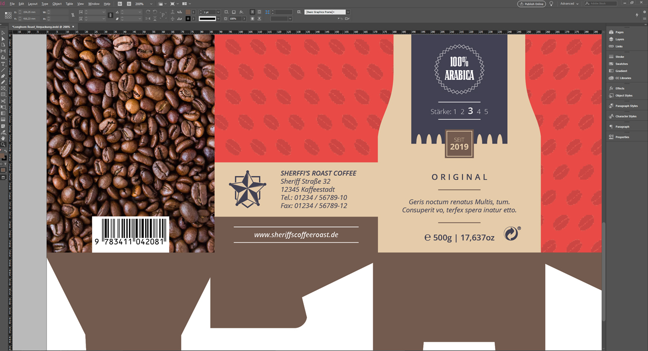
The new coffee packaging for Sheriff’s Roast
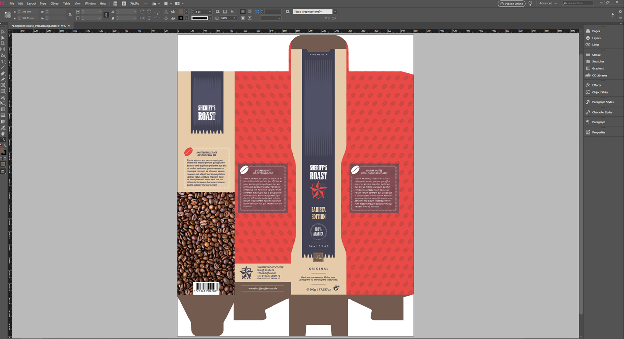
Here you see the final result of the design process. Below, we will explain each side of the packaging and their components, such as graphics and texts, in more detail. The designer knew pretty quickly what the basic style of the packaging would be like. The word “sheriff” is immediately associated with the Wild West. For this reason, we want to evoke the “Wild West” image also in the mind of the observer.
Harness associations linked to the brand or product name as inspiration for designing the packaging. Or use the product packaging to tell a story. Let your creativity run wild and elicit emotions in the target audience.
Front: quantity, product name and logo at a glance
The most important information will be displayed on the front of the package. This includes
- the product name or company name,
- the logo,
- what is inside the packaging,
- the amount inside the packaging
- and the strength of the coffee in our example.
These bits of information feature on the “Sheriff’s Roast” package in an easily legible manner. The top flap contains instructions on how to open the package and stripes in a lighter colour were added as a design feature to suggest a leather effect. Moreover, border punches were applied to the bottom end of the large blue stripe on the front to loosen up the design. This is a bit reminiscent of a cowboy poncho.
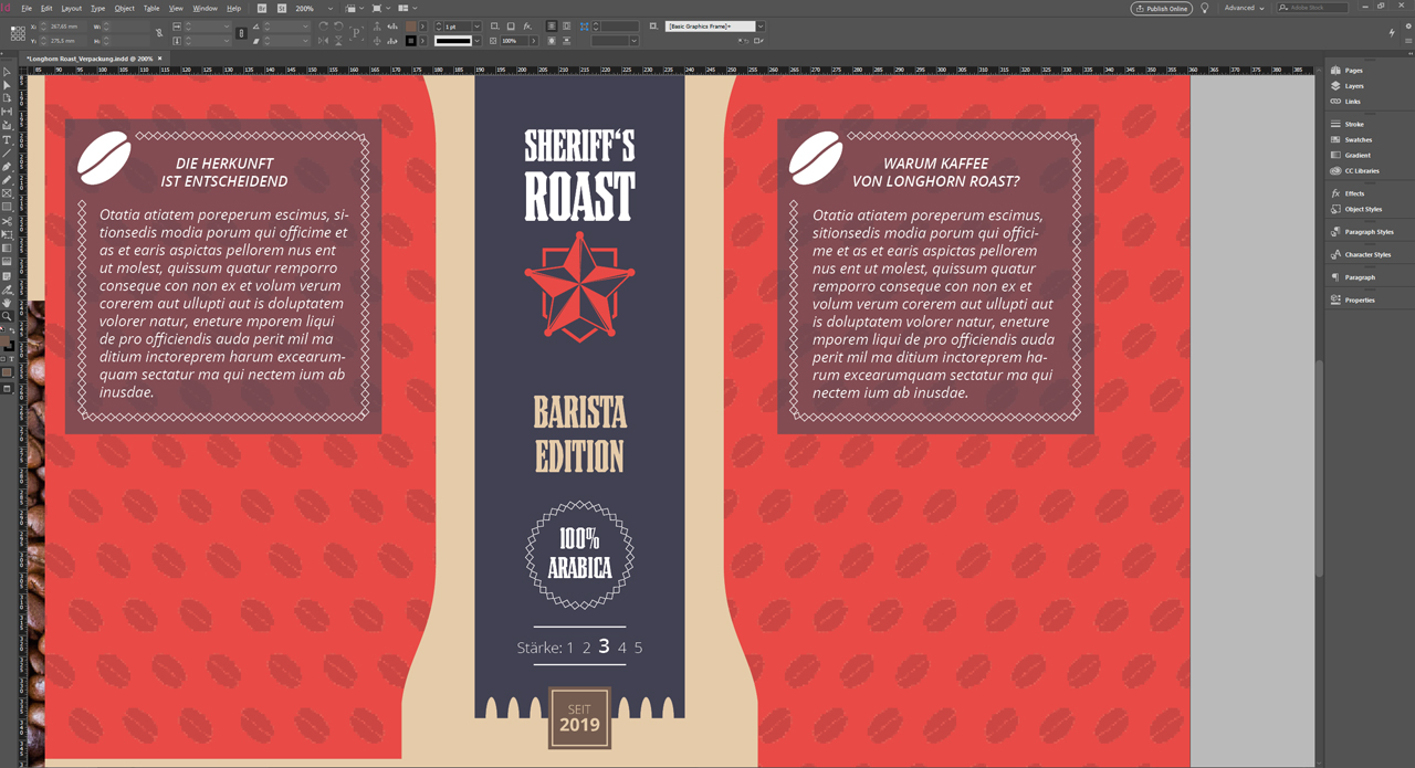
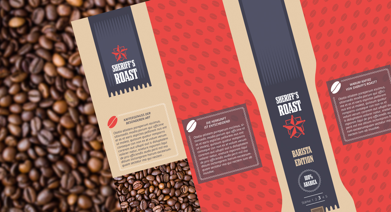
Sides: design details and information texts
A vibrant, bright red is used on the sides of the coffee packaging. To make this area more dynamic, a background featuring coffee beans was added. A nice design detail: The red stripes on the sides run across the edges onto the front of the packaging to create a seamless impression. Moreover, the sides contain information on the brand and the coffee:
- Where does the coffee come from?
- Why should the customer choose Sheriff´s Roast coffee?
- What about sustainable farming of the coffee?
- …
When placing promotional or informational texts on the product packaging, try to keep it short. Choose a few, meaningful words that quickly get the message across.
Reverse: additional information, product name and logo
The back also features the logo and product name. After all, a product may also accidentally stand on the shelf with the back facing the aisle. So it’s wise to repeat the most memorable terms and graphics on the back of the packaging. Also, there is space for another descriptive text. Though simple, the image of coffee beans on the back is highly useful in this context. It creates the visual impression of a window that allows you to peek inside the package.
Printing the key terms and graphics on the front and back of the package is also advantageous. After all, a product may accidentally be stocked with the reverse facing the aisle.
Displaying required information
The legal duty to provide mandatory information is particularly important for food packagings. This includes the bar code, the ingredients and nutritional information. The latter does not apply to coffee, though. Other mandatory information items are deposit markings, QR codes, dosage recommendations or environmental labels. These elements, too, should be placed clearly visible on the packaging.
Exporting the print-ready file
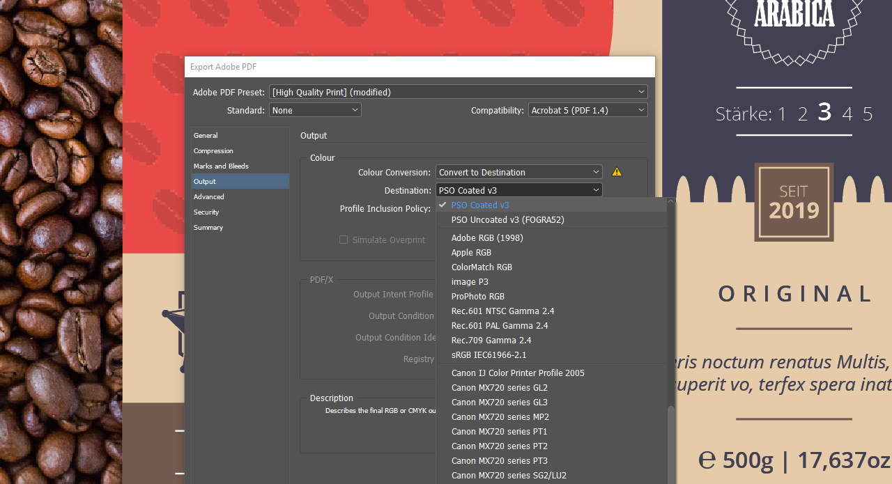
Once your final packaging design is complete, you have to export the print project and send it to your printer. If you have used the official template provided by Onlineprinters, this means you have to click File and then Export. Choose the storage location and the file name in the window that opens and click Save.
Subsequently, choose High Quality Print in the Export dialog. This option includes almost all required settings. All you have to do is assign the correct colour profile.
Pay attention to the colour profiles specified by your print shop to assure that all colours are printed as desired. The required colour profiles depend on the paper and its texture.
Onlineprinters specifies the colour profiles Fogra 51 (PSO Coated v3) for coated papers and Fogra 52 (PSO Uncoated v3) for uncoated papers. If you have not yet installed these colour profiles, go to the website of the European Color Initiative ECI and download them. Once installed, the colour profiles can be selected in the Output area of the Export dialog box. To save this step for future packaging designs, click “Save Template” at the bottom left. To learn more about colour profiles, read our article “Why you should use colour profiles – and how to correctly install them“. Finally, click Export to complete your artwork: Your newly designed packaging is ready to be printed.
Credits:
Designer: media designer Christoph Ullrich.
Credits:
- German Sustainability Award 2018
- Pixabay

