
Folded leaflets come in various layouts, shapes and sizes. DL folded leaflets are a smart way to get a lot of information across in an easy to read and handy format. In this tutorial, you will learn how to create a portrait orientation leaflet with a horizontal design and what else to pay attention to.
Folded event leaflet for a summer fete
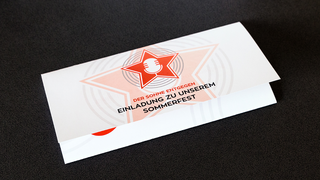
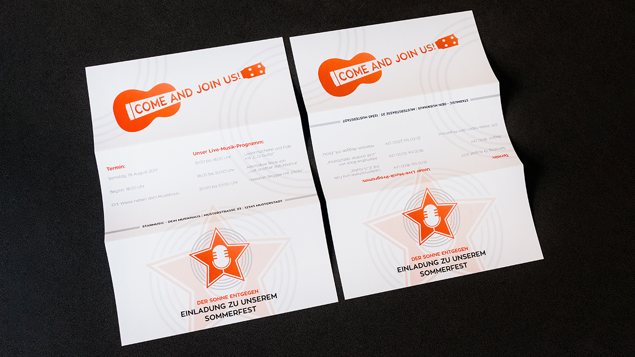
The folded leaflet we have designed for this tutorial is an invitation to the summer fete of Starmusic, a music store we have invented for this purpose. The invitation will address both customers and employees and is not personalized. Its goal is to be visually appealing, make readers curious, invite them and provide key data about the event.
Leaflet configuration:
- Number of pages: 6
- Size: DL
- Folding type: letter fold
- Orientation: portrait, i.e., the sheet is folded on the long edge of the DL format
- Design layout: horizontal
- Ideal as an invitation to various events
When creating a six page folded leaflet with letter fold in portrait orientation with a horizontal design, two criteria are particularly challenging: the letter fold and the horizontal design in a portrait leaflet (keywords: text direction vs. page orientation).
Letter fold and accordion fold
A six page folded leaflet can have a letter fold or an accordion fold. The folding type influences the sizing of the six panels.
The accordion fold has two parallel folds that go in opposite directions. Let’s take a sheet of A4 paper to illustrate this. Lay the sheet on your desk horizontally and divide it into equal thirds of 99 mm each. Next, fold the first panel down on one side, turn the sheet over and fold the other panel down on the other side. Put the folded sheet upright on its long edge and you will see that the fold has a zigzag shape.
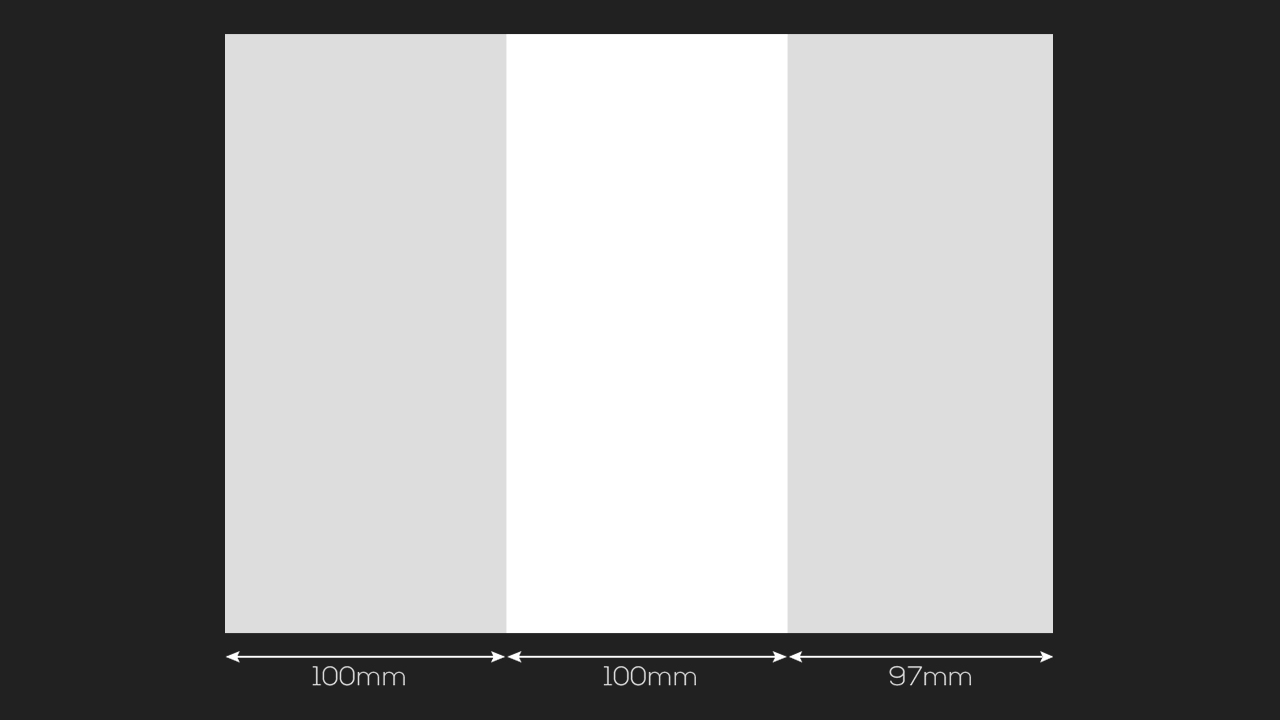
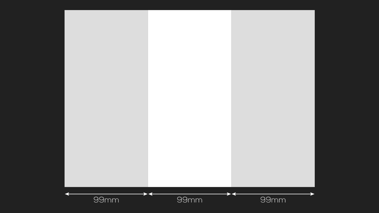
The letter fold is a bit different: Take another A4 sheet and fold the outer panels towards each other so that they overlap. This folding type uses slightly different sized panels to ensure that the panel that folds in fits nicely and does not hit the fold of the other panels. This results in panel sizes of 100 mm, 100 mm and 97 mm, allowing the leaflet to be folded neatly.
Correct text direction
If we look at our demo leaflet again, it is up to design considerations which information is placed on which panel. We recommend playing around with the demo leaflet to get a feel for the orientation and understand in which directions the panels fold. Write a number from 1 (title page) to 6 on each panel and a word in the desired orientation. This gives you an impression of how text, layout and design have to be oriented to achieve the desired impact. It is extremely helpful to visualize the finished product as this greatly facilitates the design process.
Our top tip for folded leaflets:
Take a sheet of paper and try out the desired folding type! If you already have an idea of what the design will look like, mark each panel with a number and a word to see which elements to put where in your artwork document and which text direction to choose.
Working with the InDesign template
As for any product you order from Onlineprinters, the folded leaflet product page provides templates in various configurations for Adobe InDesign. We recommend using these templates to make sure that the artwork you deliver can be processed without difficulty. This greatly facilitates the creation of correct artwork files.
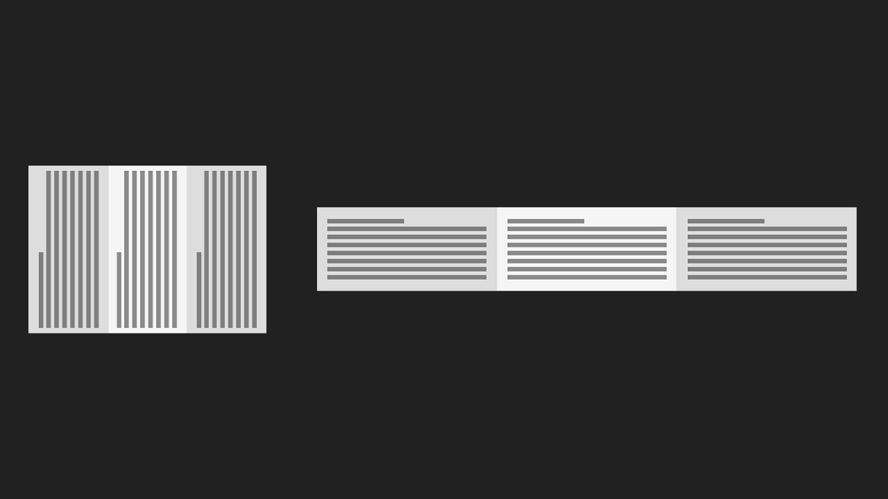
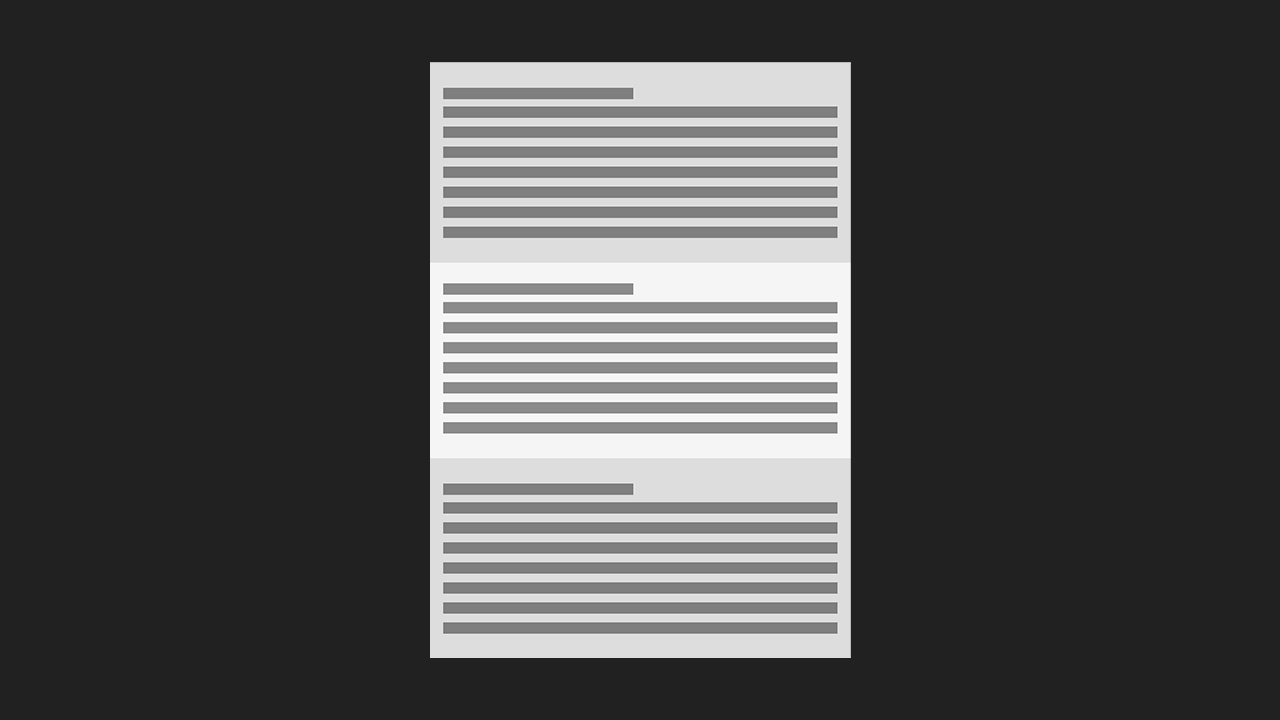
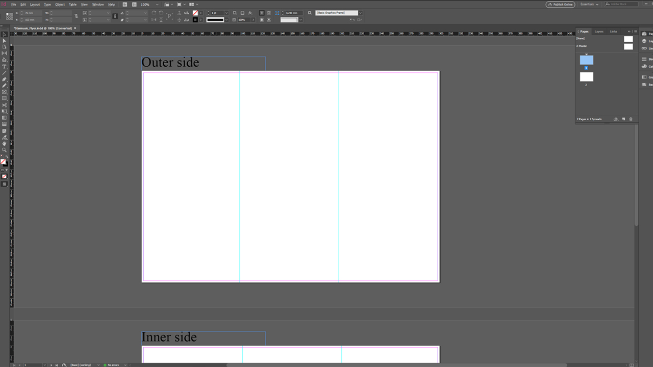
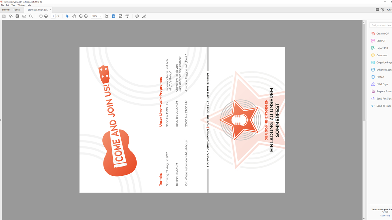
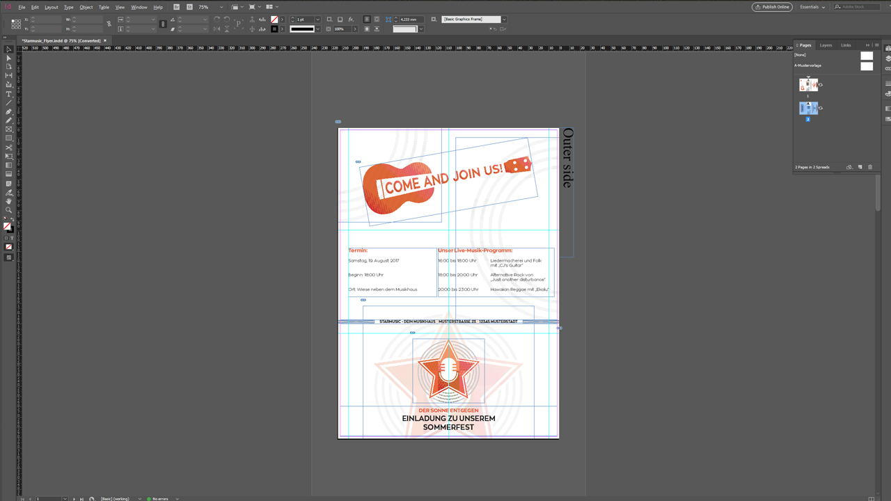
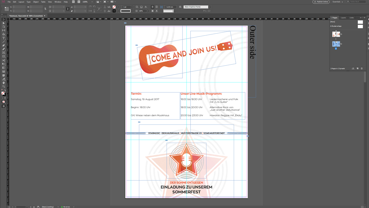
When you open the template in InDesign, you don’t see a working document with six individual pages but a two page document. This is because we need folded leaflets “completely imposed”. This means that the six pages are correctly positioned on one outside spread and one inside spread, three “upright” (portrait) DL pages side by side, long edge to long edge. The circumferential bleed of 2 mm has been set and the two fold lines are marked with guides both on the inside and the outside.
But be careful: As mentioned above, the DL panels are not exactly the same size in a letter fold. One of the three panels is a bit shorter at 97 mm; the other panels are 100 mm wide. If you take a closer look at the template, you will notice that the 97 mm panel is left on the outside spread and right on the inside spread. This is because the sheet is turned over like the page of a book during the printing process. Visualize this using your self-made test leaflet.
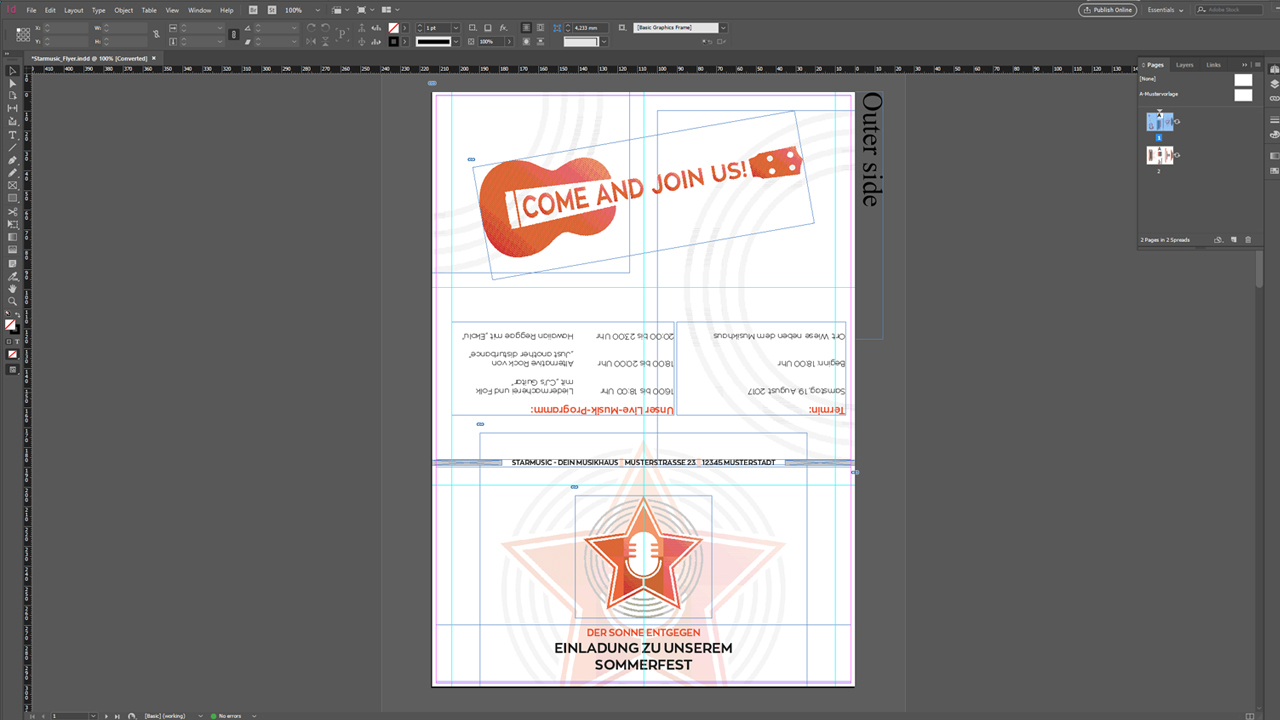
Now you will probably ask yourself why the template is laid out the wrong way. You are right, in order to create a horizontal design, you have to turn the spread view. For this purpose, InDesign provides the useful Rotate Spread function which allows you to rotate the document by 90° clockwise to make it easier to work on. What’s great about this feature is that the view is rotated in the program only – when exporting the artwork file, the page will be exported in the original orientation of the template as required by Onlineprinters.
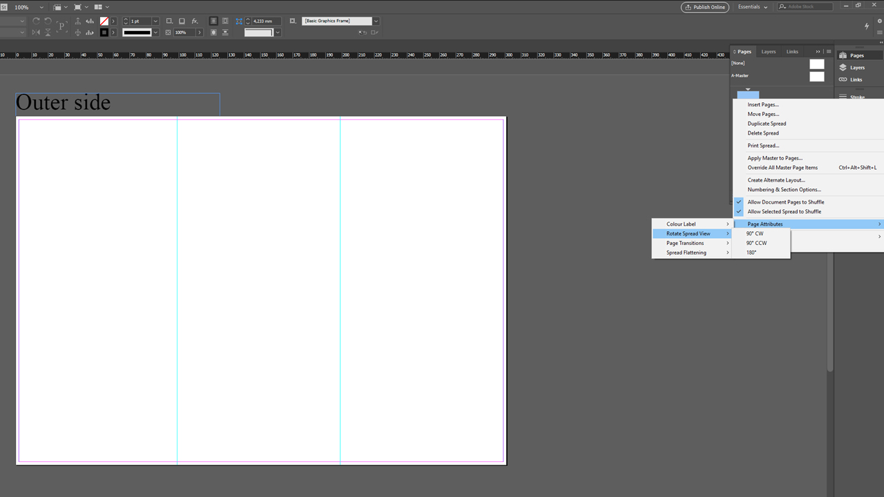
The Rotate Spread function is located in the Pages panel: Right-click on the first page (outside) and open the Pages panel. Then go to the Pages Attributes to select Rotate Spread. You can rotate the view in increments of 90°. For our leaflet, we have to rotate the document 90° clockwise. Repeat this step on the second side (inside).
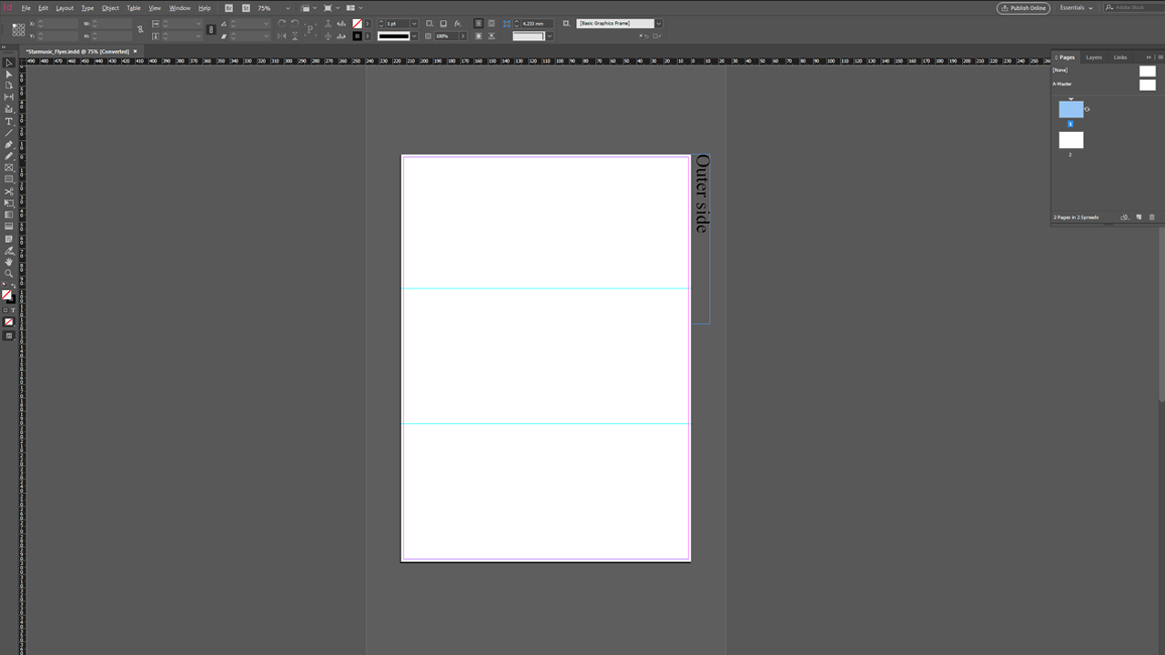
After the export, the basic orientation of the artwork is as required thanks to the Rotate Spread function.
The design of our folded leaflet
Six pages with letter fold offer a wide variety of options to design the leaflet and for the user to handle it. What does the recipient notice first? In which directions do the panels open? In the following, we will demonstrate the solution we preferred and where we placed the individual elements of our summer fete invitation and why.
Distributing the content

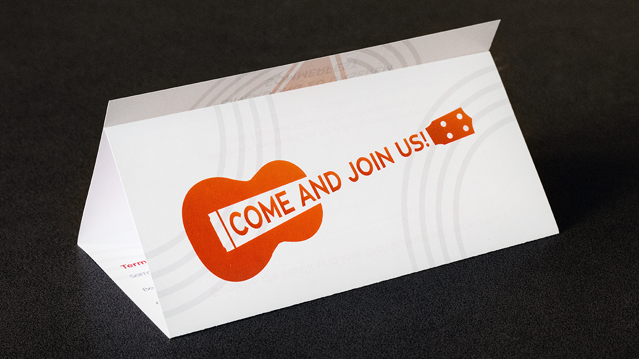
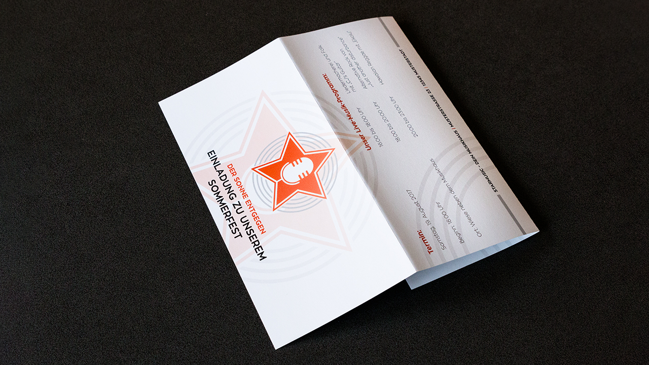
A person holding the folded leaflet of Starmusic will first see the front cover with the subject “Invitation to our summer fete” and the logo.
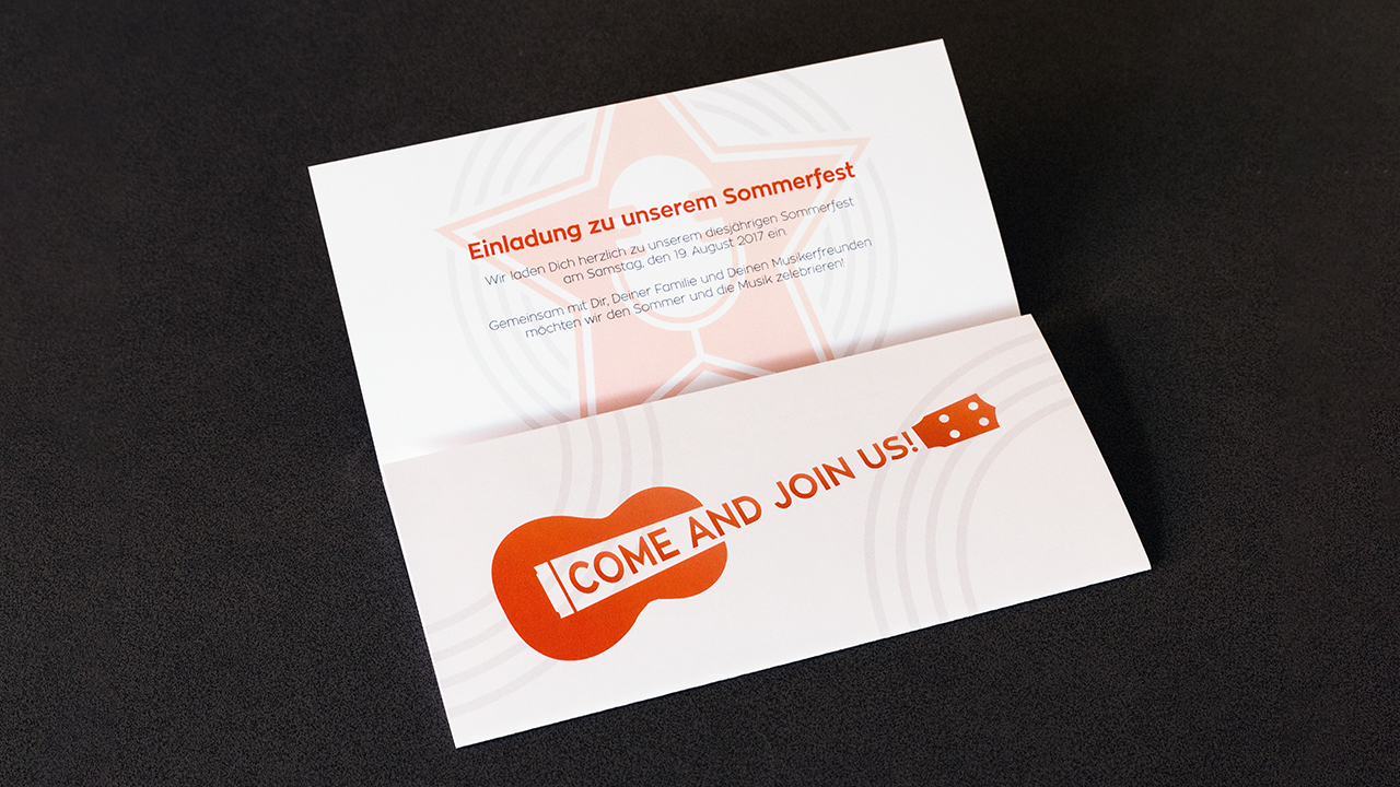
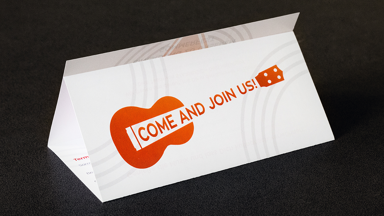
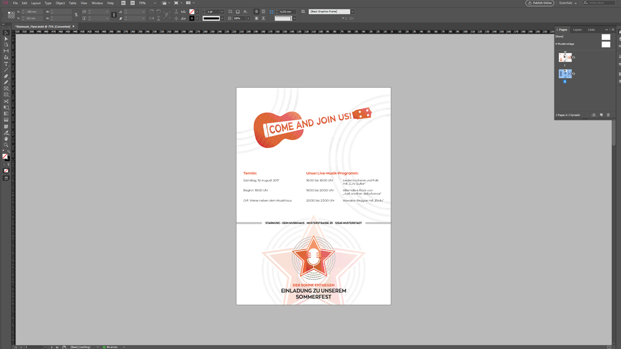
Upon opening the flyer, the eye is first drawn to the slogan “Come and join us” combined with a ukulele graphic in the corporate design of the music store.
At the top, the first part of the inside is revealed showing a short informational text.
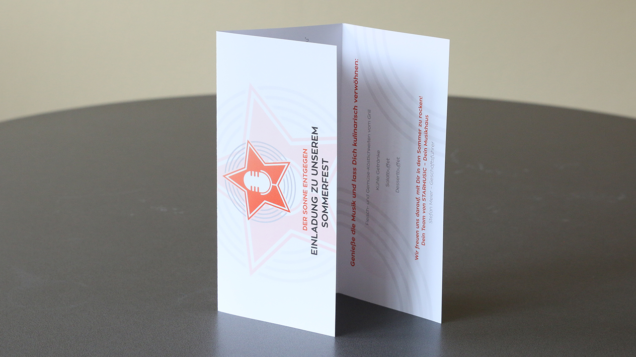
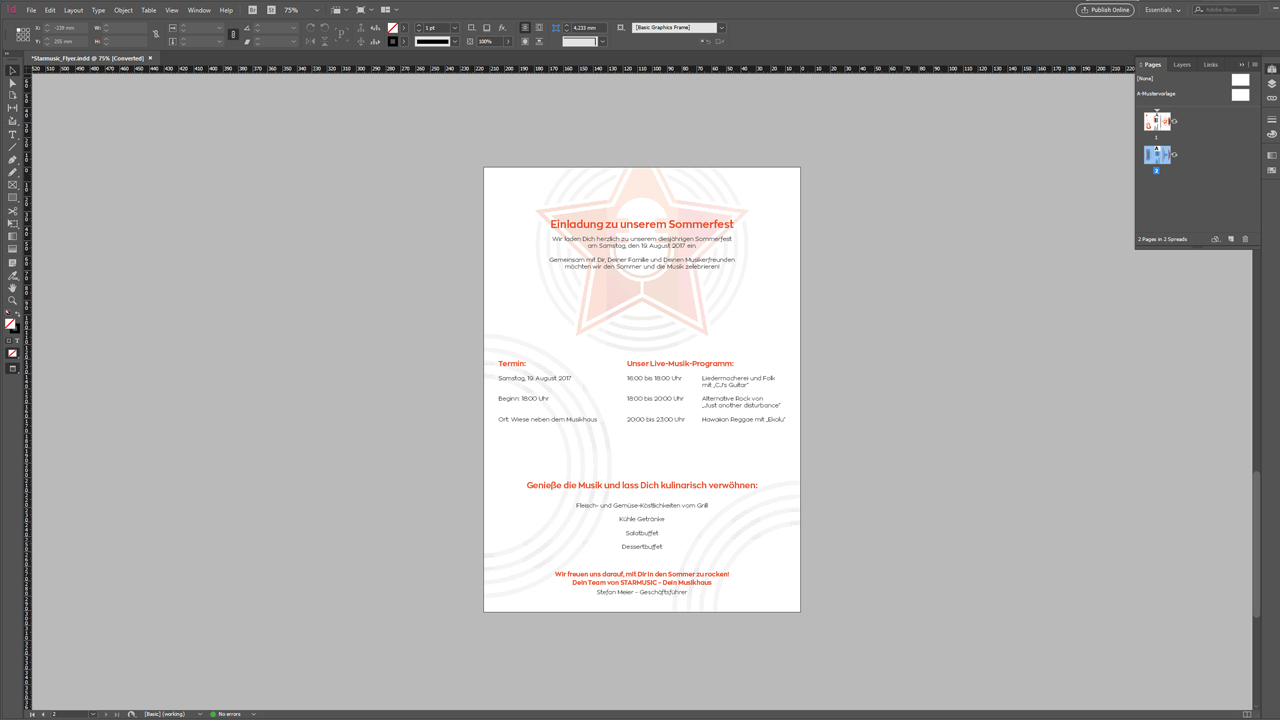
Upon opening the lower panel, the complete inside section of the folded leaflet is exposed. We see the whole invitation: the salutation and the actual invitation at the top, the place, date and agenda in the centre and additional information and the originator at the bottom. Pinned to a bulletin board, everything would thus be visible at a single glance.
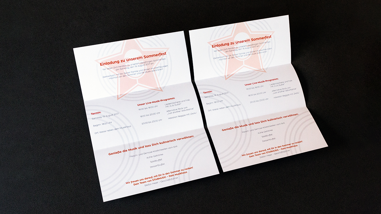
When we close the flyer again, there is the reverse side left. Here we repeat the time, the place and the agenda and add the exact address of the music store. This way, the flyer could be posted on a bulletin board also when it is closed.
Colours
Starmusic has a corporate design. Key elements are their logo and particularly the fresh orange combined with a modern grey. We want this colour combination to dominate the leaflet design, choosing orange for the headings and the eye-catching ukulele and classic black for the remaining texts. We design the background with subtle watermarks consisting of the corporate grey and elements of the logo.
Font sizes
The main goal of a folded leaflet is to present information quickly and efficiently. A text-heavy layout must be avoided in this context. Combined with sparingly used text, the font size should also be easy to read. Linear typefaces in light stroke weights require a sufficient font size here.
Design elements
We are aiming for a minimalistic design of our folded leaflet and deliberately use white space to create the desired impact. Too much white space, however, will make the folded leaflet appear empty and irrelevant. Fortunately, the logo of the music store is of some help here. The circular soundwave graphics in the logo can be used for the flyer background to create a coherent impression. From a visual perspective, it is always important to find a design element that will fill part of the background.

Folds
The guides in the InDesign template show exactly where a fold line is located. However, minor deviations can occur during printing. Therefore, headings, body text and logos should always be positioned at some distance to the fold lines. Our watermark design enables us to simply extend the watermarks beyond the fold lines. This produces a nice effect across the whole of the leaflet and prevents the design from competing with the fold line.
The same considerations apply to the bleed. You have to make sure that design elements such as the watermark actually extend all the way to the edges and that important elements are located inside the safe zone to prevent them from being clipped.
Our design
Different ways to design the reverse side
Page six of the folded leaflet, the back cover of the closed leaflet, presents a bit of a design challenge. There are two ways to turn over the folded leaflet: along the short or long edge. As the designer you have to specify the text direction on the back based on how the recipient will turn over the folded leaflet.
Version 1: Flip the closed leaflet on the long edge. This way, the three DL panels of the outside have the same text direction.
Version 2: Flip the closed leaflet on the short edge. Here the centre DL panel of the outside is opposite to the two other panels.
Generally, you have to rotate only one panel in InDesign depending on the desired text direction, namely the centre panel of the outside. In our design, it is sufficient to select everything on this panel and rotate it by 180°. So the recipient who flips the leaflet like a book (on the short edge) will be able to read the text in the proper direction.
We hope you will enjoy designing your own folded leaflet in portrait orientation with a horizontal design.
Credits:
By media designer Christoph Ullrich.

