
Handlettering fonts have an idiosyncratic character and emphasise the design that deals with very personal themes. We present the ten best handlettering fonts by Google that you can download and use for free.
Handlettering fonts are characterised, as the name suggests, by their handwritten character. Strictly speaking, this also distinguishes them from many print fonts or script fonts, because handlettering fonts do not have too many strict and clean lines. They basically convey a slight restlessness or movement, as if we were writing something by hand on a piece of paper that slips now and then or using a pen that doesn’t cover all the spots uniformly. By contrast with the classic script fonts – often with a slant to the right – the typical handlettering fonts frequently have a slight slant to the left.
Tip: Give your next existing customer mail campaign a very individual touch by using one of the handlettering fonts and thus have your advertising message printed on a postcard.
Use the handlettering fonts for witty sayings – without the hours of practice that are needed for real handlettering. You thus give every stroke of the pen an individual and attractive appearance. Let’s present you with ten hot handlettering fonts from Google for download:
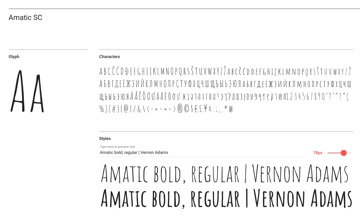
1 Our favourite: Amatic
“Amatic” consists of capital letters only. Some lettering fans actually use exclusively capital letters. The strokes of “Amatic” differ minimally in thickness and the transitions are slightly irregularly rounded or uneven. This adds a lively and individual touch to lettering projects while still being easy to read.
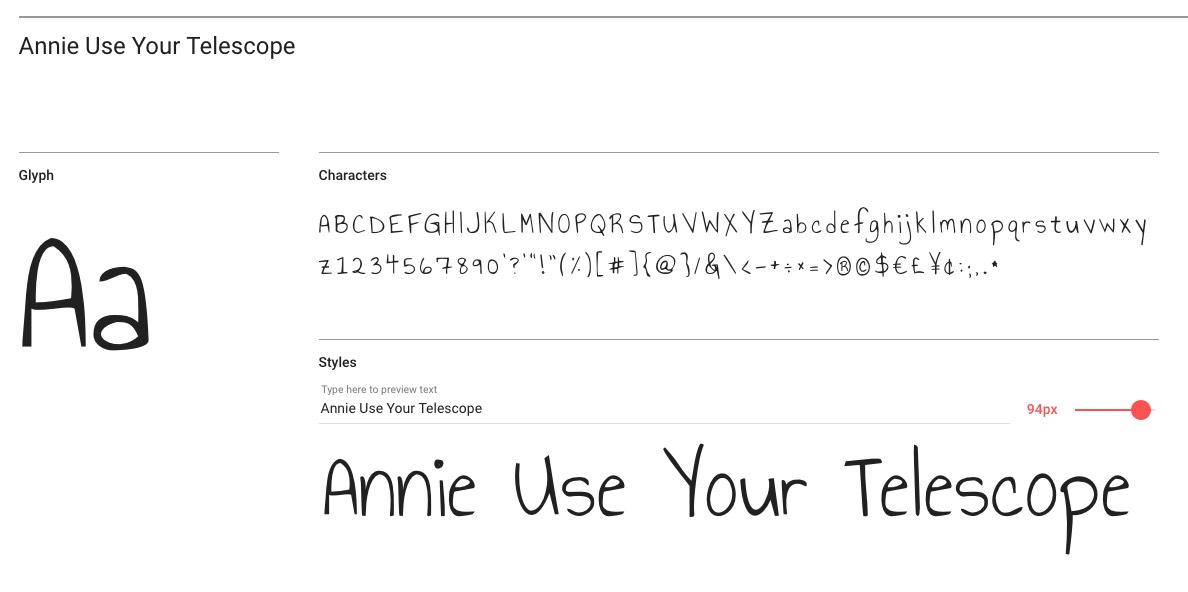
2 The somewhat awkward “AnnieUseYourTelescope”
The “AnnieUseYourTelescope” lettering font has a deliberately irregular and uneven appearance which gives it a stronger handwritten character than “Amatic”. Both the stroke thickness and the size of the capitals and the lower-case letters are irregular as is the slope of some vertical strokes. For example, the capital “T” or “U” has a distinct leftward slant which gives the font a slightly clumsy look. At the same time, this lends the font its characteristic handlettering look. You may, however, want to reduce the spaces between words which are a bit too large.
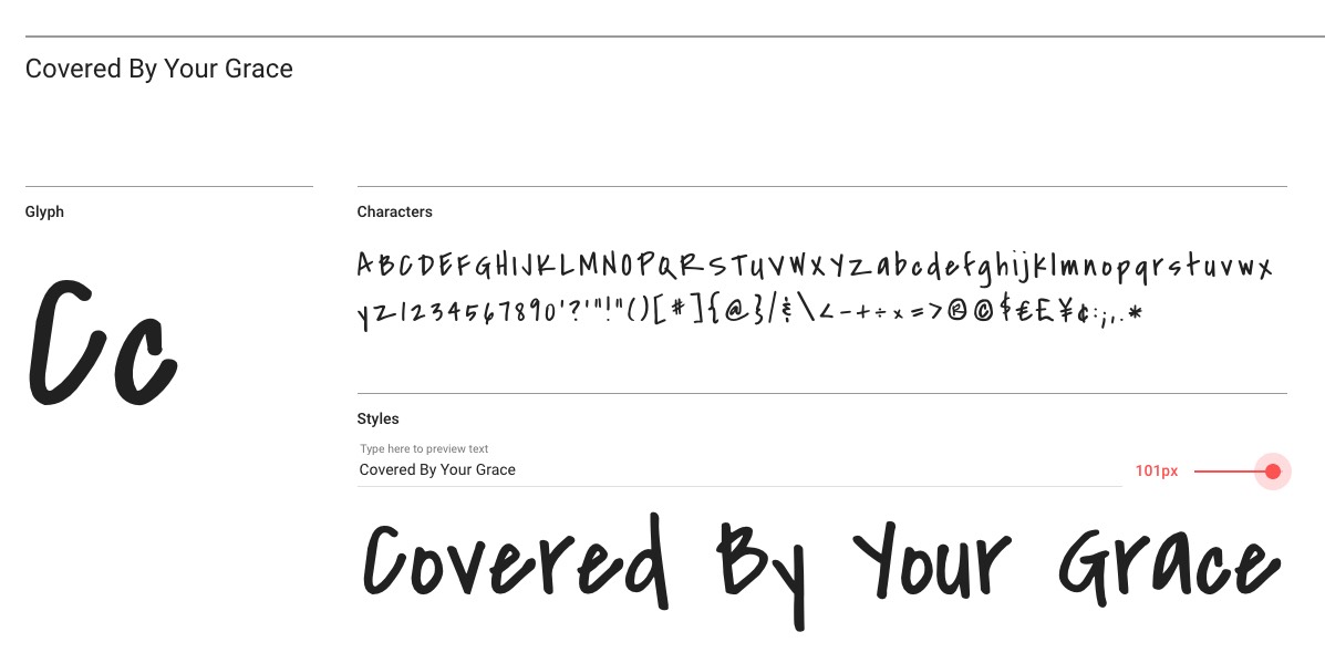
3 The slanted font “CoveredByYourGrace”
“CoveredByYourGrace” is actually based on a handwritten font. Its designer, Kimberly Geswein, used the typeface from a teacher friend. The vertical strokes are hardly slanted to the left but the horizontal elements of many capitals, such as the “A”, “B” or “E” are left-leaning, adding that typical irregular handwritten touch.
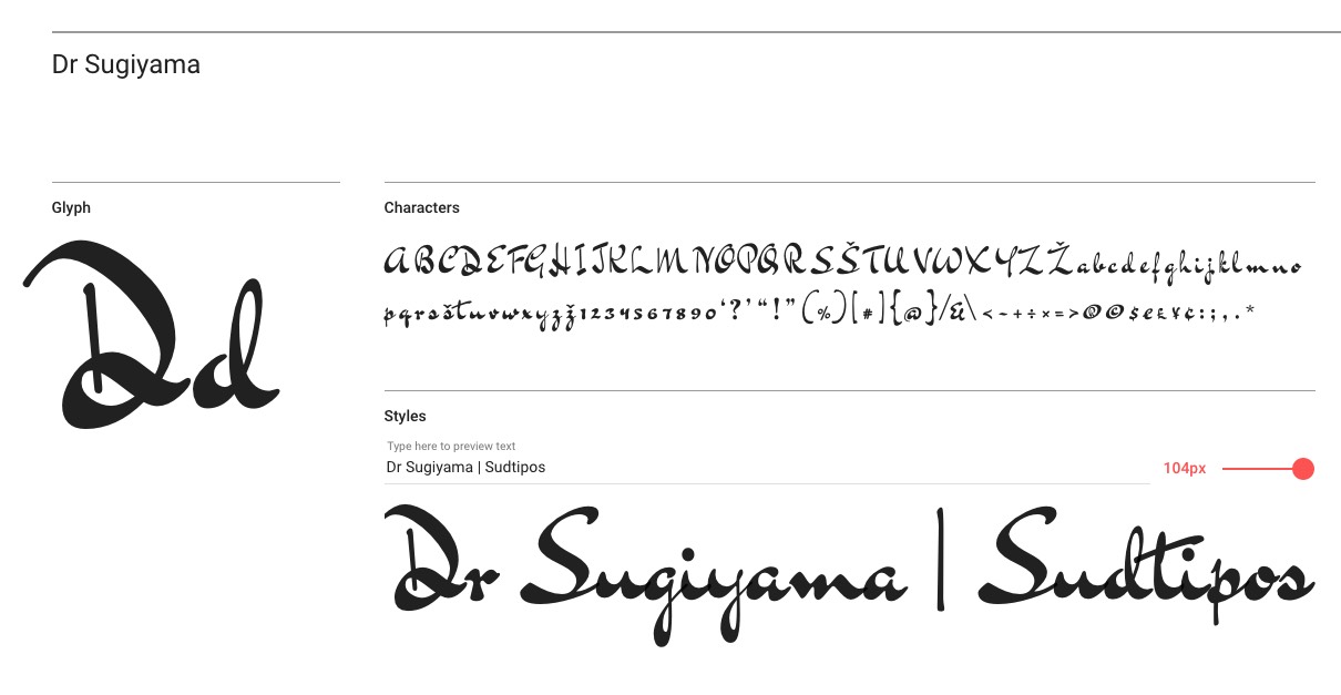
4 Dr Sugiyama of the Bluemlein scripts
Dr Sugiyama is a handwritten font from the Bluemlein scripts that were designed by professional handwriters in New York in the 1930s. It has an even appearance with alternating strokes. Due to its relatively small center lengths, it should be used in large type sizes.
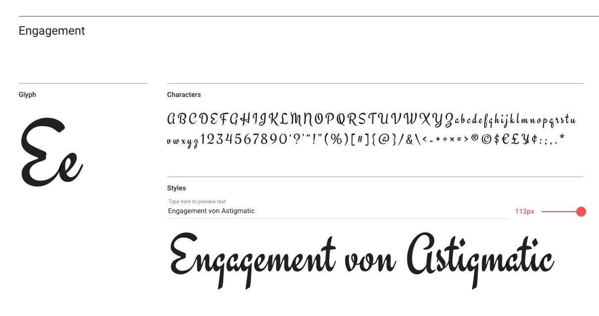
5 . “Engagement” with unusual shapes
“Astigmatic” describes its “Engagement” typeface as a brushlettering font that combines vintage elements with a modern flair. Soft contours give the font a dynamic look and the letters have little slant for a cursive font. Unusual character shapes such as the capital “A” and “E” add a personal touch.
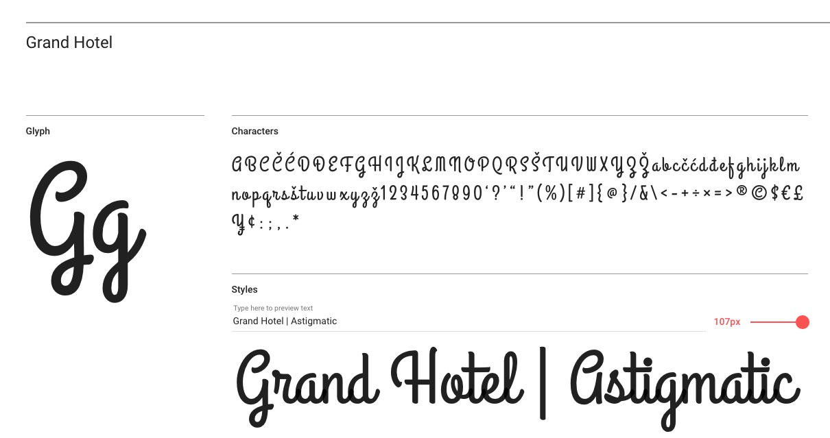
6 The 30s at the Grand Hotel
Inspired by the 1937 movie poster of “Cafe Metropole” with Tyrone Power, Brian J. Bonislawsky and Jim Lyles created the narrow “Gran Hotel” font which takes us back to the 1920s and 1930s. The connected letters are narrow, upright and feature unusual yet harmonious shapes.
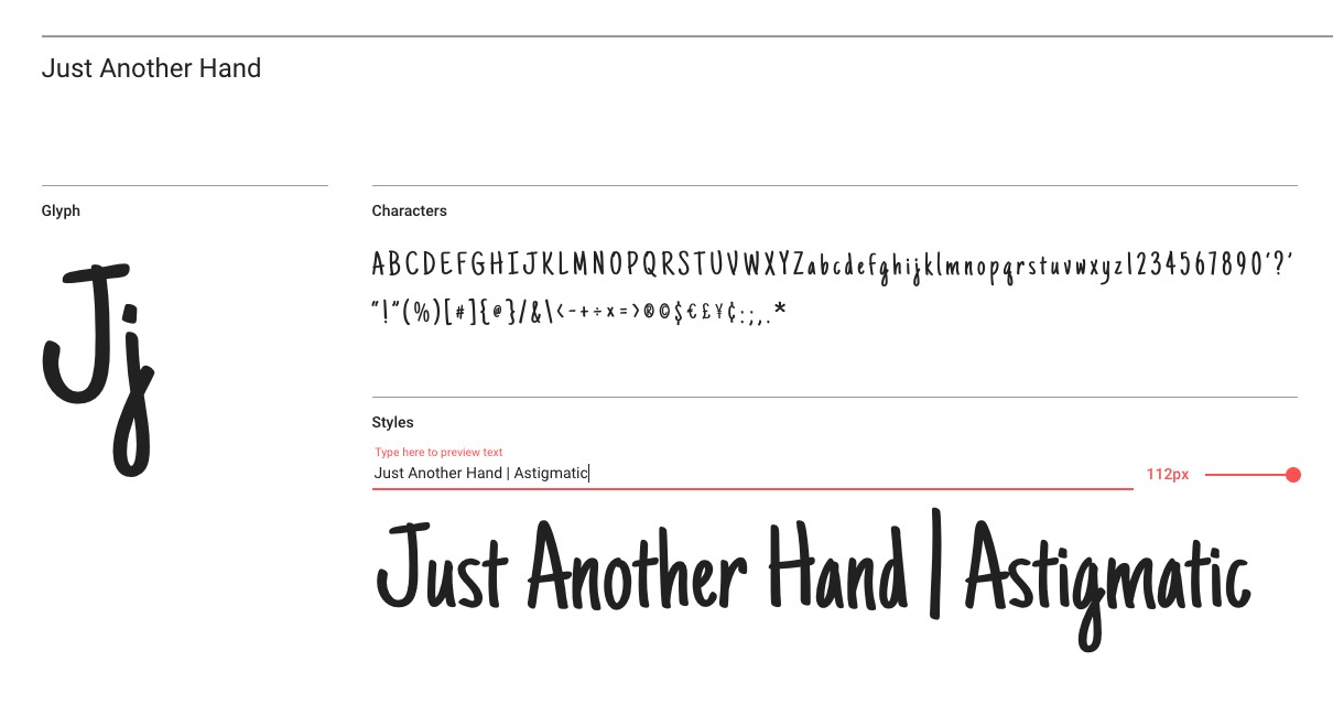
7 Brushing with Just Another Hand
“Just Another Hand” with brushlettering character is suitable for many applications. Some letters in the alphabet have a minimal slant to the left which is counterbalanced by a healthy mixture of right-leaning characters. As a result, “Just Another Hand” is a very narrow but easily legible font with a classic appearance that is not too eccentric.
Discover the brushlettering font
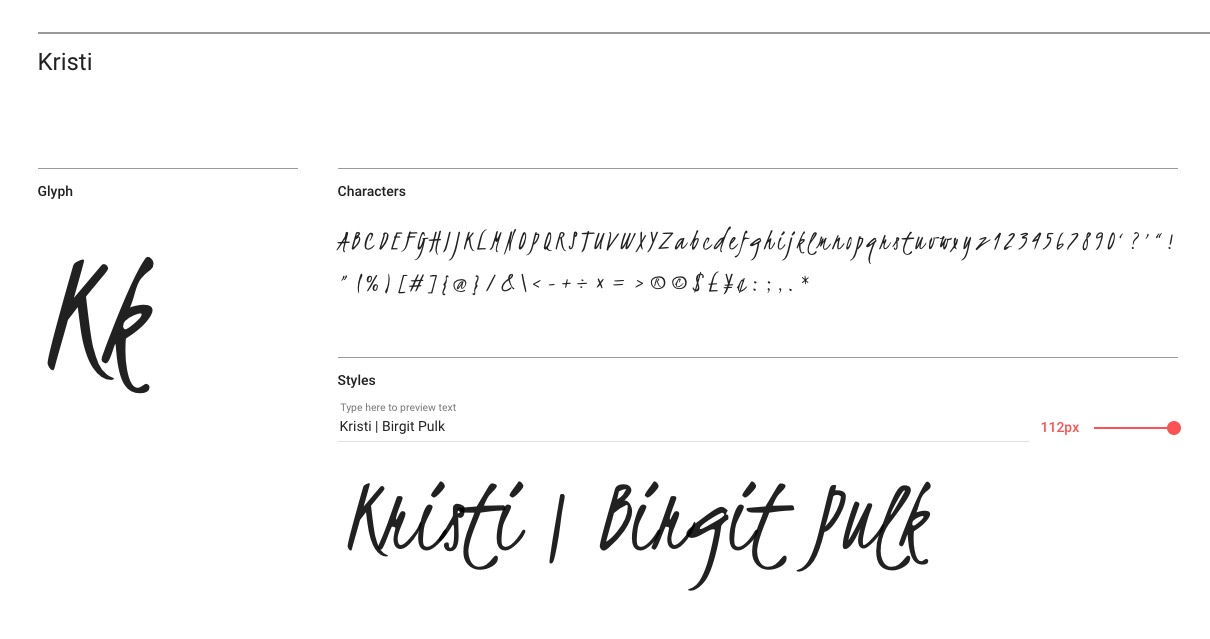
8 Calligraphy with Kristi
The faux calligraphy font “Kristi” is very eccentric and not always easy to read. However, it has a strong character and can create a very eye-catching impact depending on the application. It is characterised by its powerful up and down strokes and a very narrow style. Some capitals look a bit scrawly, such as the lower-case “q”, “z” or “g” which suddenly changes direction. This faux calligraphy font is generally more suitable for large font sizes.
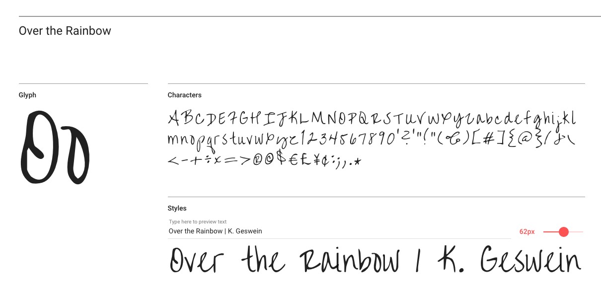
9. Over the Rainbow
And another font by Kimberley Geswein: “Over the Rainbow” conveys a sense of airiness. The large centre lengths ensure good legibility. Despite, or precisely because of, the irregular line strength and angle it is a good choice for longer texts and slogans.
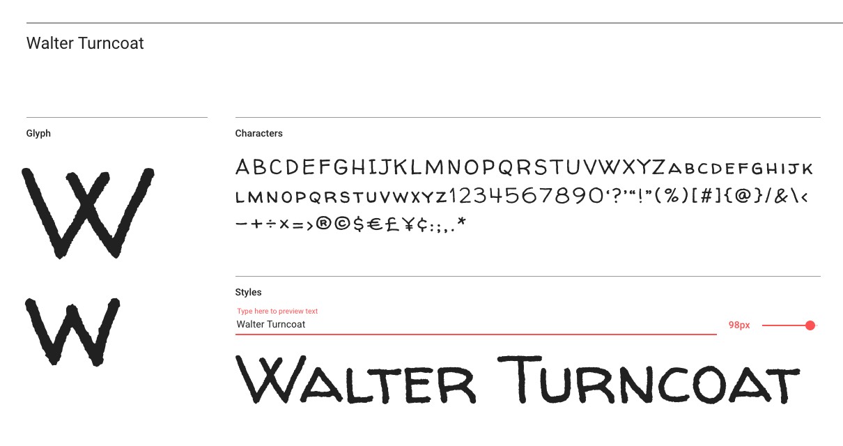
10 The small caps of Walter Turncoat
The handwritten font “Walter Turncoat” by “Principal design” is suitable for many purposes. It consists of capital letters and identically shaped small caps. The characters of the “Yankee script” are quite broad and owe their handwritten look to blurry contours.
Want more? Then take a look at our “Free typefaces & fonts” to find all kinds of inspiring articles about fonts as well as free downloads and reviews of generators.
All Google fonts are usually integrated with a link to the Google servers. Currently, (last updated: 2019) it is unclear whether this is in accordance with data privacy regulations. To be on the safe side, you should host and embed the fonts locally.
Photo credits: Mallmo via (Shutterstock), Google Fonts, Fotolia


