
An application is the first impression a future employer has of you and therefore it should be carefully drafted. Whether or not you will be invited to a job interview not only depends on the content of your application. The visual appearance is as important and consequently the font you choose. Read on to learn what to pay attention to and which fonts are suitable to create a professional job application.
Contents
- Why does the font matter in your application?
- How to find the right font
- Dos and Don’ts of formatting your application
- Which font sizes should I use?
- Leave a memorable impression with our top fonts for job applications
- No-goes for fonts in job applications
- Job application fonts – summary
Why does the font matter in your job application?
To nail a perfect first impression with your future employer, absolute diligence is required. This assures that you stand out from the crowd and ideally leave a memorable impression. Your skills, the content of your job application and the CV are crucial to achieve this. But the visual appearance is also important. All the tips can be found at a quick glance in the summary.
Make it easier for HR managers
Obviously, formal errors, spelling mistakes, naming the wrong contact person or job titles are not well received by HR agents. But also applicants whose job application documents are confusing, poorly structured or difficult to read are unlikely to get their dream job.
Neither the HR manager nor the department head have hours to spend reading applications as time is scarce and their to-do lists are long. They will want to get an overview first. Specifically, this means that HR will skim applications first before forwarding them to the relevant department. Therefore, your CV and covering letter should be designed to give a quick overview of the key facts. To achieve this, you should use a clear structure and a professional, easy-to-read font.

Stand out from the crowd
Both you and your employer-to-be will benefit if you put some thought into the choice of font. The benefits are obvious: Using a professional font in your application will emphasise your expertise and create a good impression.
Of course you can never go wrong with Arial which is much better than a cartoon-style font like Comic Sans or an ornate cursive font. To stand out from the competition, you should consider possible alternatives to commonly used fonts.
Our tip: The focus of an application is always on the content. First complete your CV and the cover letter before you format them and start looking for the perfect font.
An interview with Irena Röck, head of HR at Onlineprinters
We have asked our colleagues from HR and got some valuable tips for applicants from head of HR, Irena Röck, who has been with ONLINEPRINTERS for seven years.
 ONLINEPRINTERS Magazine: How much time have you got to read an application?
Irena Röck: Honestly, not much really. Of course, we check each incoming application for the required qualifications. A clearly structured application folder makes a good impression and facilitates our work. Ideally, it is optimised for screen viewing which is slightly different from printing on paper because we get all applications digitally through our career portal as most large companies nowadays do.
ONLINEPRINTERS Magazine: What do you pay special attention to (visually) in applications?
Irena Röck: The overall impression of an application must be right. It should be professional and authentic. This does not mean that no colours are allowed. If applicants subtly incorporate the company colours in their application, you can tell that they have put some thought into it. The writing, however, should be no-frills, i.e. black text on a white background. As a rule, you can say that the more creative the job and the industry, the more creative the application can be.
“THE MORE CREATIVE THE JOB, THE MORE CREATIVE THE APPLICATION CAN BE.”
Applicants should make sure to use an easily legible font type and size. One small issue we often come across are incorrect page breaks where the complimentary close and the signature of the cover letter are placed separately on page 2, for example. A simple but easy-to-fix formal error – just double check the application as a whole before submitting it.
ONLINEPRINTERS Magazine: What effect does the font of an application have on you?
Irena Röck: Some fonts like Times New Roman are more conservative, others are more modern. Subconsciously, you naturally draw conclusions about the applicant from this. It is important that the font is easy to read and fits both the job description and the company. If you apply for a job with a young start-up business, you should go for a modern typeface, such as Calibri or Arial.
ONLINEPRINTERS Magazine: Can you name a good or bad example?
Irena Röck: It gets difficult, for example, when someone tries to include too much information in the cover letter, turning a one-page cover letter that is meant to pique the reader’s interest into an extended repetition of the resume over two pages. Some applicants use a font that is too small or completely ignore standards and cram all the information on a single A4 sheet.
“ENCLOSE WORK SAMPLES AS AN ATTACHMENT.”
Of course there are candidates who want to demonstrate their skills already in the cover letter. Applicants should enclose additional information, such as work samples, as an attachment. This can give them an edge later on.
How to find the right font
There is a wide selection of fonts available out there. They come with and without serifs, pre-installed, free or paid and in a variety of font styles. Microsoft Office alone provides several hundred pre-installed sans-serif fonts and serif fonts which are more or less well-suited for business correspondence like a job application.
But how do you find the right font for your application?
Legibility: “Form follows function”
Legibility is key in your application. After all, you want the content of your application to be grasped quickly by the reader. So choose a font that easy to read and does not confuse readers. To make sure your application is legible, you should stay away from playful fonts, such as Comic Sans or Curlz MT. Also ornate cursive fonts like Blackadder ITC or powerful fonts like Impact are not suitable for an application.

Our tip: Do not overload your application with multiple fonts. All documents you create yourself, such as the cover page, the CV and the cover letter, create a much better impression if they use the same design.
How your application is written reflects on you
The font used in your application should create a professional and trustworthy impression. You should therefore choose a font that you think appears trustworthy. What’s right for a Christmas card isn’t necessarily the best choice for your application.

Scientifically proven effects of typeface on perception
Several studies have been conducted on the effect of fonts. The study “The Effect of Typeface on the Perception of Email” by Doug Fox, A. Dawn Shaikh, Barbara S. Chaparro is one of them. The researchers proved that the perception of competence, professionalism, maturity and trustworthiness of the sender and the quality of the information displayed is related to the font used.
Graphic designer, Sarah Hyndman, also emphasises the importance of the fonts used in a job application. She has dedicated herself to the mission “Why do fonts matter?”. In her workshops, Sarah proves time and again that the choice of font has an impact on the viewer’s perception. Of course the context is also important. For example, a font can cause a sweet to be perceived as either more sweet or more sour.
Read our article Typography basics to learn which factors influence readability and which impacts different fonts can have.
Establish a connection to the company
You can also use fonts to establish a connection to your future employer. Not every font is suitable for this purpose though. To create a sense of familiarity, you can use their corporate typeface or a font that looks similar.
Utilise your future employer’s corporate design to pretend that you already belong to the company. This creates a sense of familiarity and connectedness. The corporate design represents the company and assures recognition. Get inspired by the company’s website or catalogues, ads etc.
You can either rely on your gut instinct to find a similar font or examine the source text of your prospective employer’s website by clicking the right mouse button and choosing View source. A new window opens. Press Ctrl + F to open a search box. Enter Font to see the corresponding font information of the page in the source.
Important! If the selected font is not installed on your recipient’s computer, your formatting will be lost. The system will automatically replace the font to assure it can be read by the recipient. This means you don’t know which font will be used and what effect it will have.
Our tip: Save your cover letter and resume as PDF. The exchange format makes sure that all settings and fonts are retained even if they are not installed on the HR manager’s computer. And you are certain to nail the desired effect with your application. To learn how to create a PDF; read our article Creating a PDF – with online and offline programs.
Dos and Don’ts of formatting your application
Once you have chosen a font for your application, you should stick with it. Be careful with font styles: Too many font styles (weights, tracking and alignment) can be overwhelming. Used sparingly, however, italic or bold typeface can be ideal to highlight important information. Don’t overdo it and proceed systematically.
Proper formatting of headings You can choose a different font size or font that harmonises with the font of the body text. A second font should be equally well readable and professional in appearance as your main font. A word of caution: Do not use more than two different fonts in your application. This can be confusing and create a sense of indecision and lack of structure.

Be careful with font colours in your application because colours evoke certain associations in the reader just like fonts. For example, blue is considered calm and businesslike, red passionate and exciting. You should avoid colours in the cover letter and use plain black text on a white background to keep the reader focused on what is essential.
Depending on the job and industry, you can add a little colour on the cover page or in the CV. Especially in creative professions there is more freedom of design for job applications than in research or commercial occupations. This is a good opportunity to give your future employer a taste your design skills. You can either user colours to emphasise your personality or borrow colours from the corporate design to convey a sense of familiarity.
Which font sizes should I use?
The standard font size in text editors is usually 11 or 12 point. Depending on the font, this size is considered easy to read and can therefore be used for body text, e.g. in the cover letter. But not all 11 pt fonts are the same size. In fact, the size may vary from font to font:
|
|
|
There are no exact specifications for font sizes in applications. Just play around until you have found the right size. The 11-13-15-rule can be used as a guide:
- Body text such as the cover letter or longer paragraphs in the resume should be 11 point
- 13 pointis suitable for subheadings, the sender, address and date.
- 15 pointis a good choice to highlight your name in the header to make sure it stands out and will be remembered.
To learn more about font sizes, please see our crash course in font sizes.
Leave a memorable impression with our top fonts for job applications
Generally, you can’t go wrong with standard fonts, such as Arial or Times New Roman. They are easy to read, create a trustworthy impression and are pre-installed on your computer. However, the latter is one reason why these fonts are used frequently and may appear uninteresting and boring in an application. There are several alternatives that can help you stand out from your competition. We show you our pre-installed favourite fonts and present typefaces you can download for free to create successful applications.

Our top 10 pre-installed fonts
Grotesque fonts or sans serif fonts
Arial is certainly one of the best known sans serif fonts. The so-called grotesque fonts have a no-frills and modern appearance. The following fonts work great for job applications:


Serif fonts
These fonts additionally have small lines or strokes attached to the end of a larger stroke in a letter. Times New Roman is one of the most popular serif fonts. Add an individual touch to your application by using one of the following alternatives:


Our 5 favourite job application fonts to download
Are you looking beyond pre-installed fonts? Below you will find a selection of interesting alternative fonts for job applications which you can download at no cost.
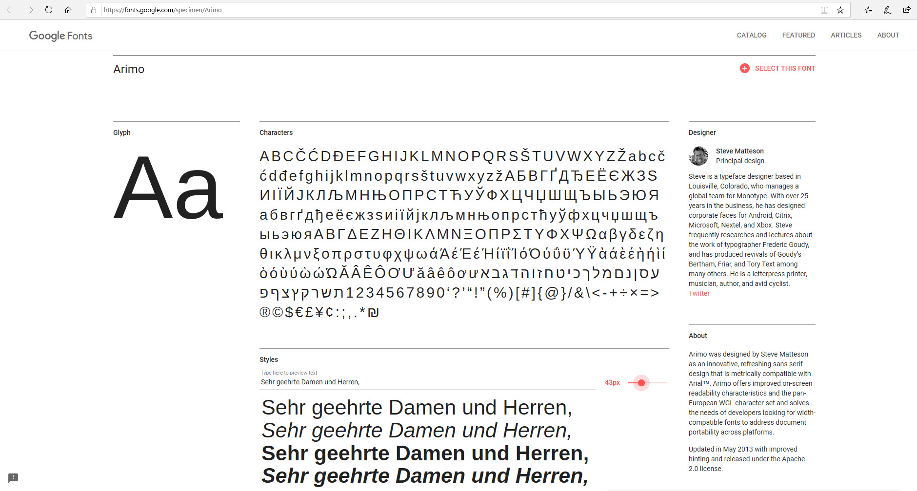
Arimo
Arimo font was designed as an innovative, fresh grotesque font that is metrically compatible with Arial. Arimo offers improved readability features on the screen.
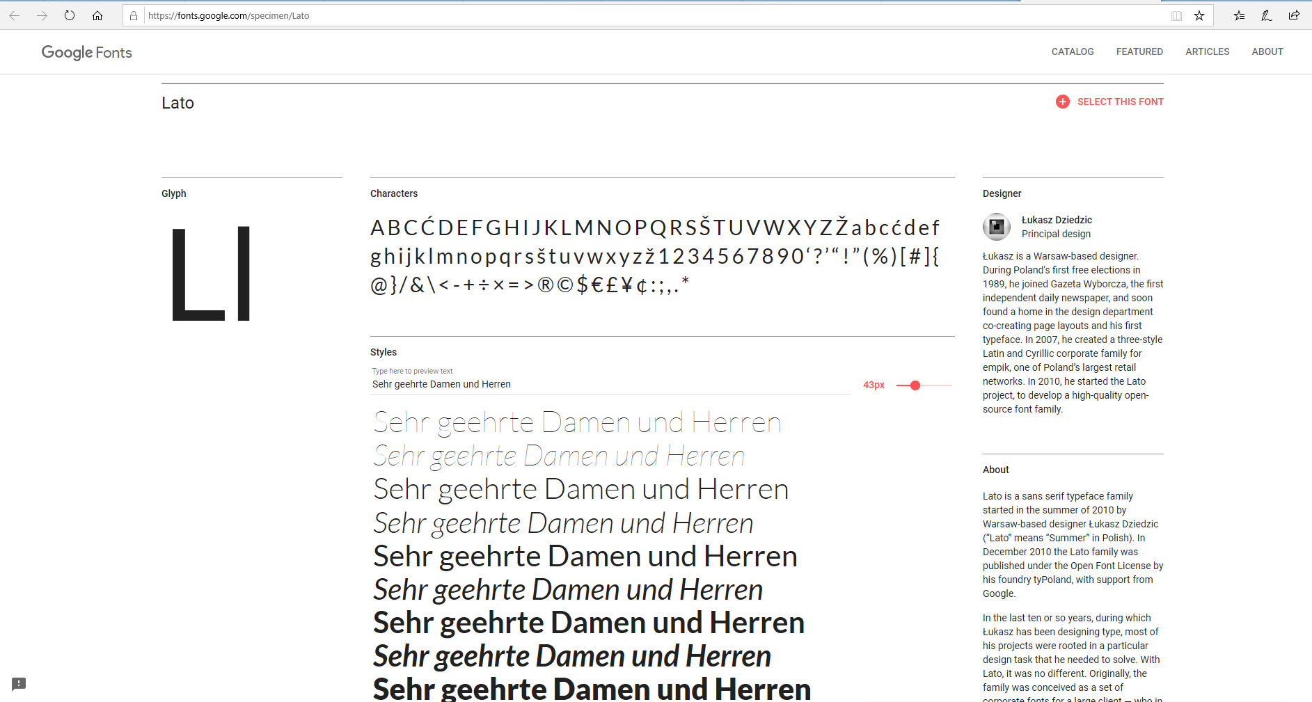
Lato
Lato is both the Polish word for “summer” and a sans serif font family. The semi-circular details of the letters give Lato a feeling of warmth and the strong structure is associated with stability and seriousness. Designer Łukasz Dziedzic describes his typeface as “Masculine and feminine, serious but friendly. With the feeling of summer.”
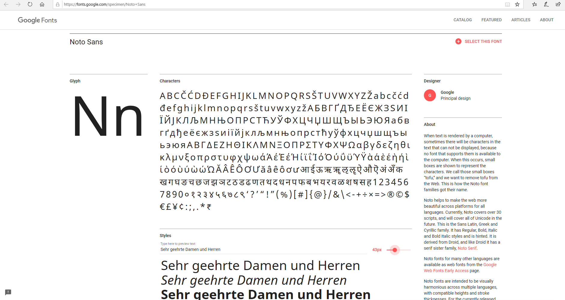
Noto Sans
This font was developed to make the web more beautiful across platforms and languages. The font is available in four font styles, currently covers over 30 scripts and will cover the entire Unicode range in the future. Noto fonts are designed to create a harmonious appearance in multiple languages with compatible heights and weights.
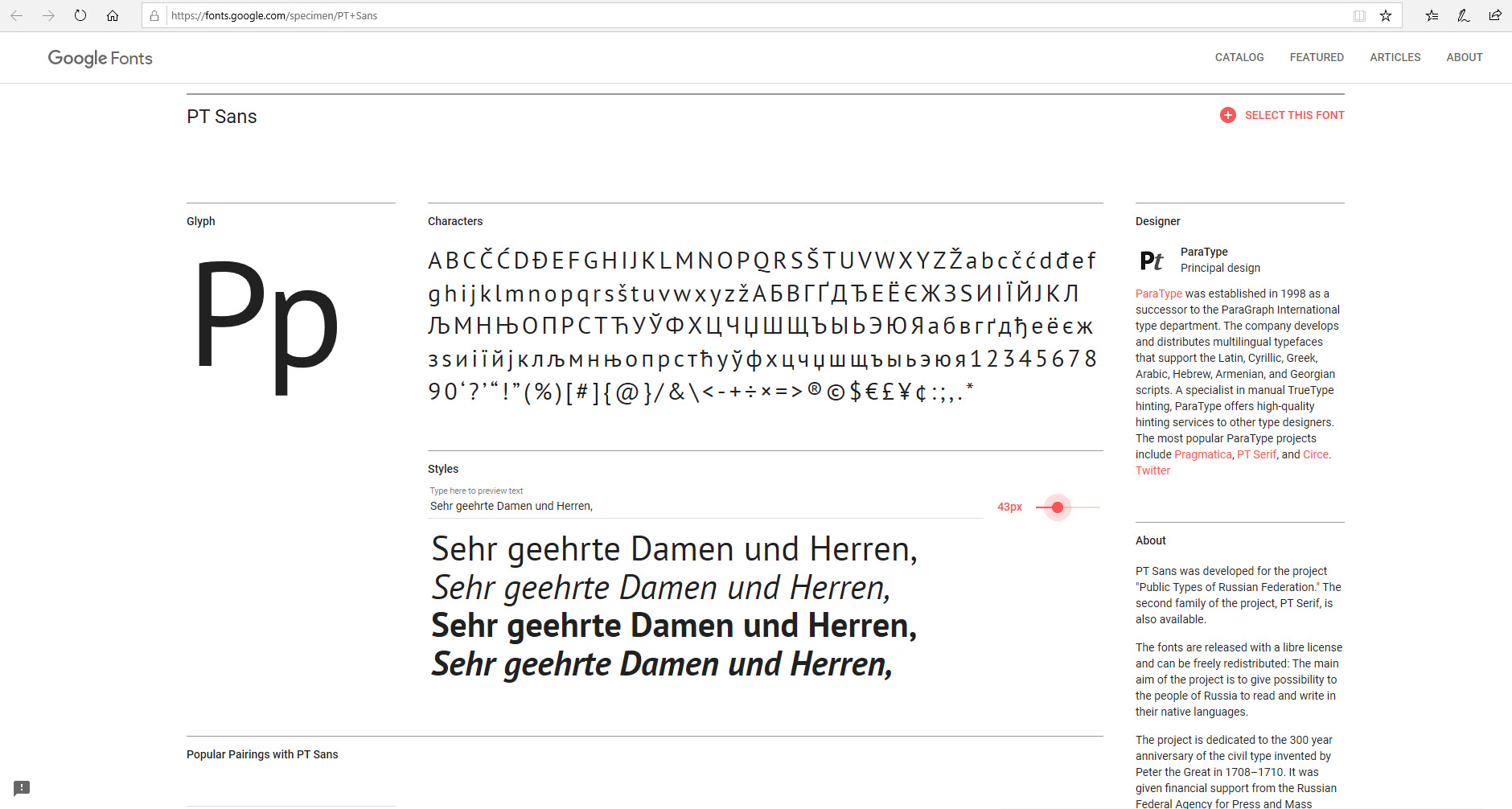
PT Sans
PT Sans was developed for the project “Public Types of Russian Federation” and can be freely distributed. The font family includes a total of eight styles.
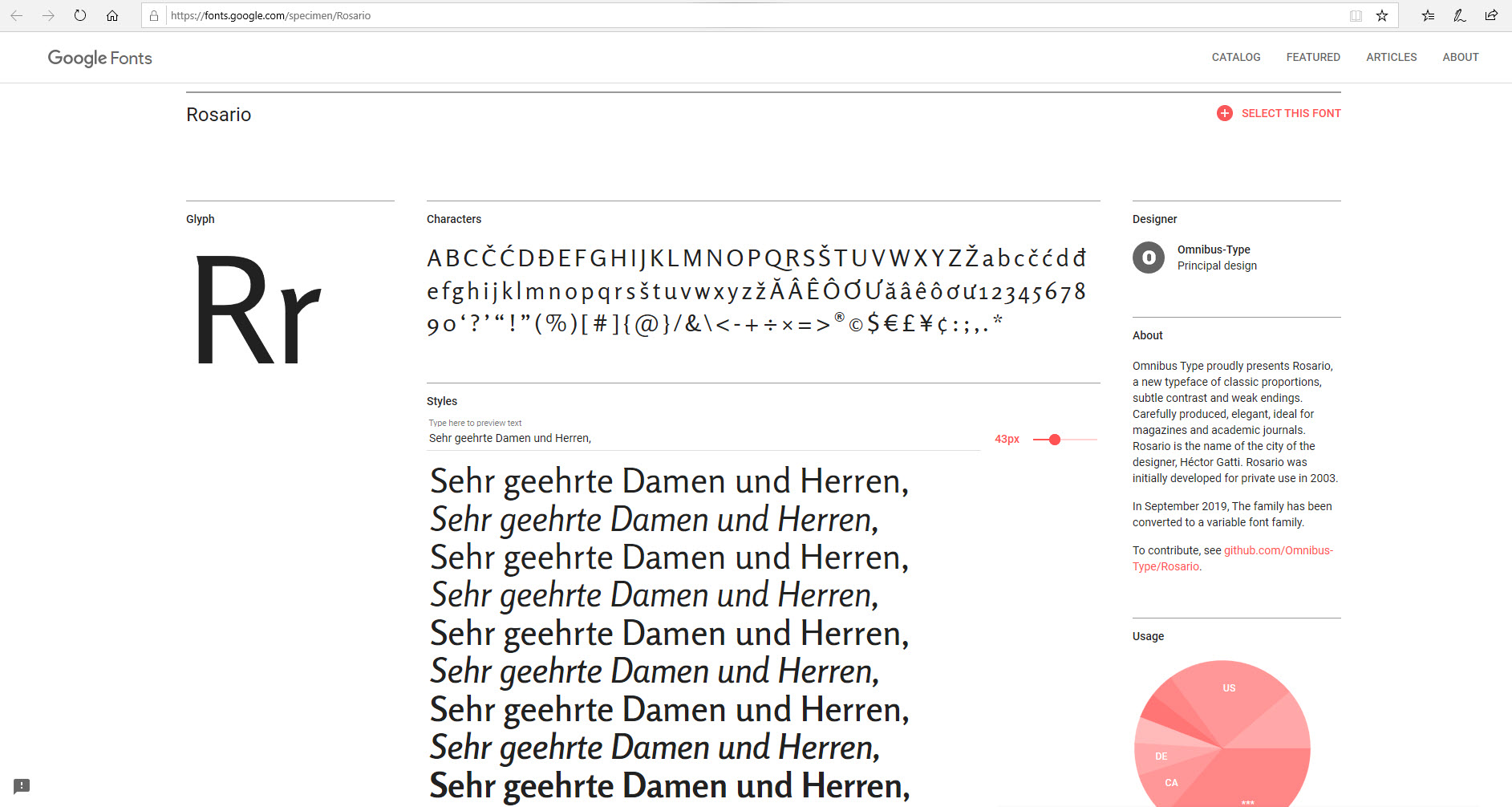
Rosario
Rosario is a typeface with classic proportions, subtle contrast as well as weak ends and is ideal for texts in magazines and technical journals.
No-goes for fonts in job applications

There are many options to pimp your application to create a professional appearance. But there are many stylistic pitfalls that can undermine this impression. Be sure to avoid the following when choosing a font for your application:
- playful, ornate or filigree fonts
- text or typefaces in capital letters
- mixed fonts (more than two fonts)
- too many different font sizes
- too small fonts in “small print” style
- too large font types and sizes that scream at the reader
Job application fonts – summary
Below we have summed up the key points that will help you find a suitable font for your application and hopefully your dream job, too.
- Content is king! Take care of the content first, then the form (DIN 5008), formatting and finally the font.
- Leave a good impression – not with a flashy or playful font but with your expertise.
- Stay focused! Never use more than two different fonts and do not use flashy fonts to keep the reader focused on what is essential.
- To retain the desired formatting: Save your documents as a PDF.
Do not overdo it! Use highlighting such as boldface or underlining selectively. - Use contrast for good legibility: Black text on a white background is the most easy to read. A coloured background looks unprofessional and usually impairs readability.
- Find middle ground: Choose a font size that is easy to read. 11 or 12 point font size is recommended for body text.
Find more fonts and inspiration for your texts in our font collections:
Photo credits: FrankHH, Tetiana Yurchenko, stockfour, WAYHOME studio, Feng Yu via Shutterstock; Pixabay, mali maeder, Lukas via pexels
Credits: https://imbstudent.donau-uni.ac.at/ee11mmd4/2017/12/03/typografie-und-wirkung/, https://www.youtube.com/watch?v=KAidpE5UW0Y&feature=emb_logo, https://www.itsnicethat.com/nicer-tuesdays, https://www.typetasting.com/,
https://journals.sagepub.com/doi/abs/10.1177/154193120605001725, “The Effect of Typeface on the Perception of Email” by A. D Shaikh, D. Fox, B.S. Chaparro


